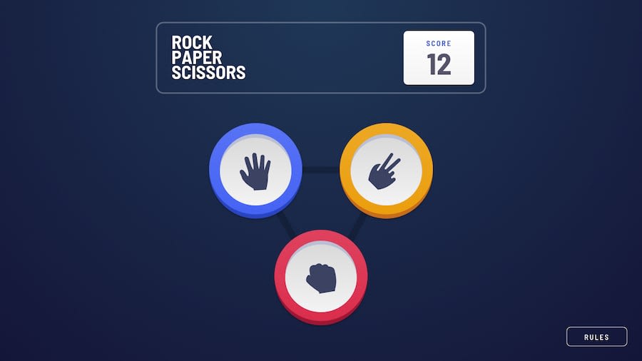
Design comparison
Solution retrospective
My solution is a little different than the mockups because I wanted to add both versions of the game. I also put extra effort into making the game accessible because I want to get better at providing a great experience for as many users as possible. So, I included a "reduce motion" preference, and tried to provide a good experience for keyboard-only users and screen readers too.
Something I learned creating this game is that accessibility isn't something you can just toss in last minute — it takes planning, and lots of testing.
Let me know if you have any feedback for me regarding the user experience or anything else.
Thanks!
Community feedback
- @ApplePieGiraffePosted over 3 years ago
Greetings, Matthias! 👋
Amazing job on this challenge! 👏 I really like the animations that you added and the feature to reduce motion in the game! 😀 In addition to that, the rest of your solution looks great and works well! 👍
Keep coding (and happy coding, too)! 😁
1
Please log in to post a comment
Log in with GitHubJoin our Discord community
Join thousands of Frontend Mentor community members taking the challenges, sharing resources, helping each other, and chatting about all things front-end!
Join our Discord
