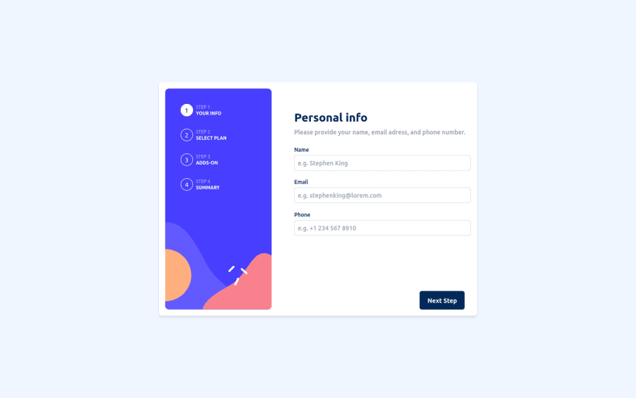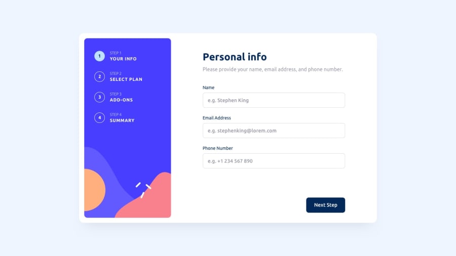
Design comparison
SolutionDesign
Solution retrospective
Any feedback would be appreciated! Thanks in advance :)
Community feedback
- @mixchexPosted almost 2 years ago
Hi Joaquin,
This is really good, well done!
One little user experience related issue working through the form is that the add-ons listed are not very clickable unless you click on the checkbox. It would be very useful for users to have the whole area clickable. An easy way to do this could be to add a
<label>element around the checkbox<input>instead of a<div>element.Great effort!
Marked as helpful1@JoadevyPosted almost 2 years ago@mixchex Great idea! I've just implemented it, thanks a lot for your time.
0@mixchexPosted almost 2 years ago@Joadevy Great, glad it was helpful - Works like magic!
1
Please log in to post a comment
Log in with GitHubJoin our Discord community
Join thousands of Frontend Mentor community members taking the challenges, sharing resources, helping each other, and chatting about all things front-end!
Join our Discord
