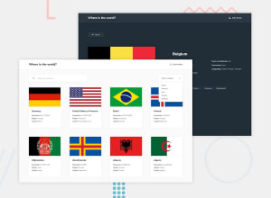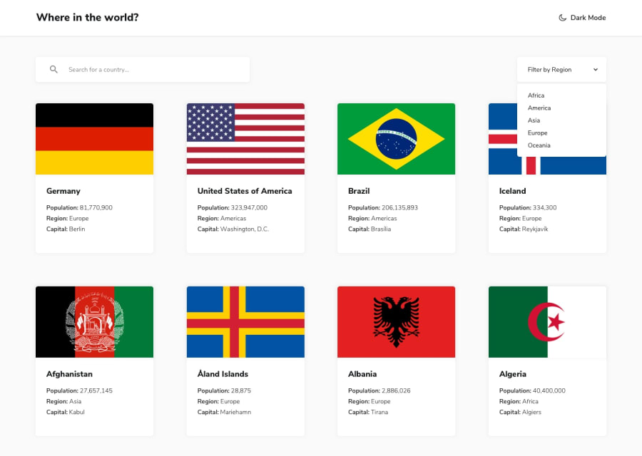
Design comparison
Solution retrospective
made this after taking Freecodecamp tutorial for react on youtube. please suggest what and where I can improve.
Community feedback
- @pikapikamartPosted about 3 years ago
Hey, awesome work on this one. Desktop layout looks nice but the layout in general needs to have bit more of contrast. Right now, each country card's color somehow for me makes it seem blend with the layout background-color. Maybe using the design provided where the layout's background is bit grey and each country card has white background with a
box-shadowto give borders. Site is responsive as well and the mobile state looks fine as well.Some other suggestions would be:
- Putting the
headerout of themaintag would be really great so that it will sit on its own row on the markup, since it is a primary landmark for users:
<header /> <main />- Using
buttonfor the theme toggle works but it is not the preferred markup. It should be done using 2 radio buttons which is inside afieldsetalong with itslegendelement. Have a look at my solution on this one inspect the markup on the theme selections. - Also the
svgbeing used on the theme-selections should be hidden since it is only a decorativesvgso usearia-hidden="true"on it. - Your form-input right now currently lacks associated
labelto it or anaria-labelto which will define the purpose of theinputelement. - Your
outlinefor interactive elements lacks a color, right now you are usingtransparentfor theoutline. - You should not have used the
atag as the parent container that will nest all of those country information. What you could have done is something like, theatag will only wrap the country-image, then use theatag's::afteror::beforeto have full height and width of the whole card so that the card will be clickable. This way, the markup will be valid. - For each of those country card information, those 3 items below each country name could have used
ulsince those are "list" of information and not usingh4to wrap the full text.
VISITING A COUNTRY (on this :>)
- Don't wrap an
atag within abuttonor vice-versa. For this, use onlyatag since thego backwould be a link. It is invalid to nest those two since there will be 2 focus on each item. Try usingtabkey on thego back. - Same as well for those information, use
ulon them since they are "list" of items. - Again, for each border-countries, use
atag only and notatag insidebutton.
Aside from those, great job again on this one.
Marked as helpful0@SandeepGumastePosted about 3 years ago@pikamart Thank you very much for the feedback. Will get to fixing these now. :) i guess I need to start watching tutorials on accessibility and semantic html.
1 - Putting the
Please log in to post a comment
Log in with GitHubJoin our Discord community
Join thousands of Frontend Mentor community members taking the challenges, sharing resources, helping each other, and chatting about all things front-end!
Join our Discord
