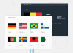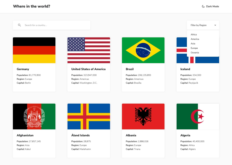
React & Styled Components to fetch data from API
Design comparison
Solution retrospective
Any feedback is welcome,
Thanks in advanced
Community feedback
- @palgrammingPosted over 3 years ago
Looks really good ⭐⭐⭐⭐⭐ and I like that you show the user what region is selected on the drop down
1@sergiobarriaPosted over 3 years ago@palgramming thanks for the feedback.
Yes, I though marking the selected region gives a better UX. I'm still on the fence on how much should/could I improve regarding the original design. I'm guessing there is no real limit because at the end this are challenges for practice and the more you add, then is safe to say is better for you to improve...
0@palgrammingPosted over 3 years ago@sergiobarria yes I think as long as you are improving on the challenge then it is fine to change the challenge from the original as long as it is not changing the overall focus of the project
0
Please log in to post a comment
Log in with GitHubJoin our Discord community
Join thousands of Frontend Mentor community members taking the challenges, sharing resources, helping each other, and chatting about all things front-end!
Join our Discord
