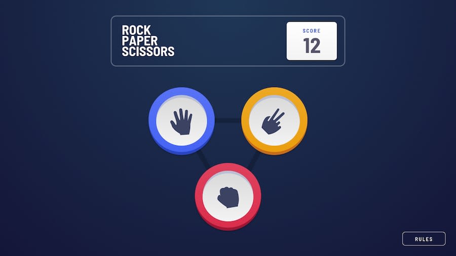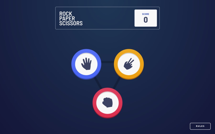
Design comparison
Solution retrospective
It was fun to build this game. I tought that it will take me more time to build, but I've done it in two days so i'm happy! 😁 Made my best to make it as good as possible. I also made it as PWA and it was my first time doing that. Any feedback would be hightly appreceated! ❤
Community feedback
- @antaryaPosted over 3 years ago
Hi Filip,
It is really good, and the animation is nicely done 👍
I would suggest a couple of refactoring/improvements that might clean the code a little bit and will point to the topic that might save you a day of debugging on another project.
Good to know:
-
In your code you have
setScore(score + 1);
which should work as expected in this case but it is a safer way to do it using functional updatessetScore((prevScore) => prevScore + 1)
. In this case, you can removescore
from props, and make it safer for async cases, which is very well explained in this article https://kentcdodds.com/blog/use-state-lazy-initialization-and-function-updates#dispatch-function-updates. Resource regarding functional updates https://reactjs.org/docs/hooks-reference.html#functional-updates. -
You might also consider useful this post that compares custom prop ref and ref using
forwardRef
https://stackoverflow.com/questions/58578570/value-of-using-react-forwardref-vs-custom-ref-prop.
Refactoring/improvements:
-
In
Choosing
component you passsetIsChoosing
which is used withhandleUserChoice
, why not to movesetIsChoosing(false)
tohandleUserChoice
? -
In the
Choosing
component, if you update according to the previous suggestion, there is no need to havehandleClick
; you can directly passhandleUserChoice
toButton
. -
Three-button in
Choosing
component looks like a good candidate to generate them on the fly:
const icons = { paper: iconPaper, scissors: iconScissors, rock: iconRock, }; const choices = ['paper', 'scissors', 'rock']; function Choosing ... { ... choices.map((choice) => <Button image={icons[choice]} type={choice} handleClick={handleUserChoice} text={`${choice} button`} /> ) ... }
- The icons list can be reused in the
Result
component, which will make your code cleaner.
// instead of this image={ houseChoise === "paper" ? iconPaper : houseChoise === "rock" ? iconRock : iconScissors } // you can now write this image={icons[houseChoise]}
-
For accessibility, add alt on the Rules close button.
-
Try to stick to one className format (score__text, house-btn, playAgainBtn) and do not use id for styling. Check this formatting rules http://getbem.com/introduction/.
-
I also noticed that when height is small, elements are on top of each other.
It is awesome that you added PWA support 🚀
I hope this will be helpful.
See you on the coding trail.
Marked as helpful0@filip65Posted over 3 years ago@antarya Thanks a lot for your suggestions! I know that a could done it as you mentioned in first point, but it didn't work for me, so I done it that way, but i known, that it isn't a good practice. And I really appreciated tip for buttons, in future I'll definitely do it like that.
0 -
Please log in to post a comment
Log in with GitHubJoin our Discord community
Join thousands of Frontend Mentor community members taking the challenges, sharing resources, helping each other, and chatting about all things front-end!
Join our Discord