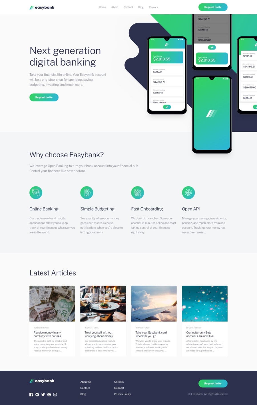
Design comparison
SolutionDesign
Solution retrospective
Hey guys, any feedback would be appreciate ! It's my first time with SCSS 😎
Community feedback
- @ApplePieGiraffePosted over 3 years ago
Hello, Célestin Delahaye! 👋
Good work on this challenge! 👍 Kudos for trying out Sass! 👏 I like the animation of the mobile menu icon! 😀
A few things I'd like to suggest are,
- Adding a max-width to the content of the page to prevent it from becoming too wide on extra-large screens.
- Adding some anchor tags to either make the titles of the article cards or the article cards themselves links.
- Taking another look at the layout of the article cards and making sure there's an even amount of space between them as much as possible (currently the space between the cards seems to vary between just right and a little too much when the size of the screen changes).
Hope those tips help. 🙂
Keep coding (and happy coding, too)! 😁
1@ZeeeratulPosted over 3 years agoHello ApplePieGiraffe ! Thank you so much for your feedback, I will definitely think about the max-width for my next project 👍 I agree with you: the layout for the articles isn't really good, I should add more space between them !
Thanks again and Happy coding 😁
1
Please log in to post a comment
Log in with GitHubJoin our Discord community
Join thousands of Frontend Mentor community members taking the challenges, sharing resources, helping each other, and chatting about all things front-end!
Join our Discord
