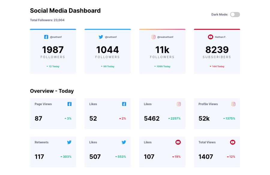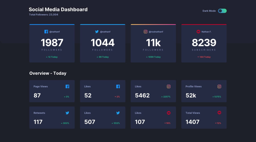
Design comparison
SolutionDesign
Solution retrospective
I challenged myself into creating this Dashboard using React & SASS and I am happy with my result, but there are some things I didn't resolve:
- the top background
- it remained some empty space on the bottom of the page which I colored with the dark theme
- color to be more aesthetic
- the total number of followers is not dynamic
- maybe there are some more which I haven't seen yet However, I am waiting for your valuable opinions and suggestions meant to improve the result. :)
Community feedback
- @denieldenPosted almost 3 years ago
Hi Ciprian, try to add css
heightproperty for div with class.top-cardsansd fix the remained some empty space on the bottom of the page :)Marked as helpful0
Please log in to post a comment
Log in with GitHubJoin our Discord community
Join thousands of Frontend Mentor community members taking the challenges, sharing resources, helping each other, and chatting about all things front-end!
Join our Discord
