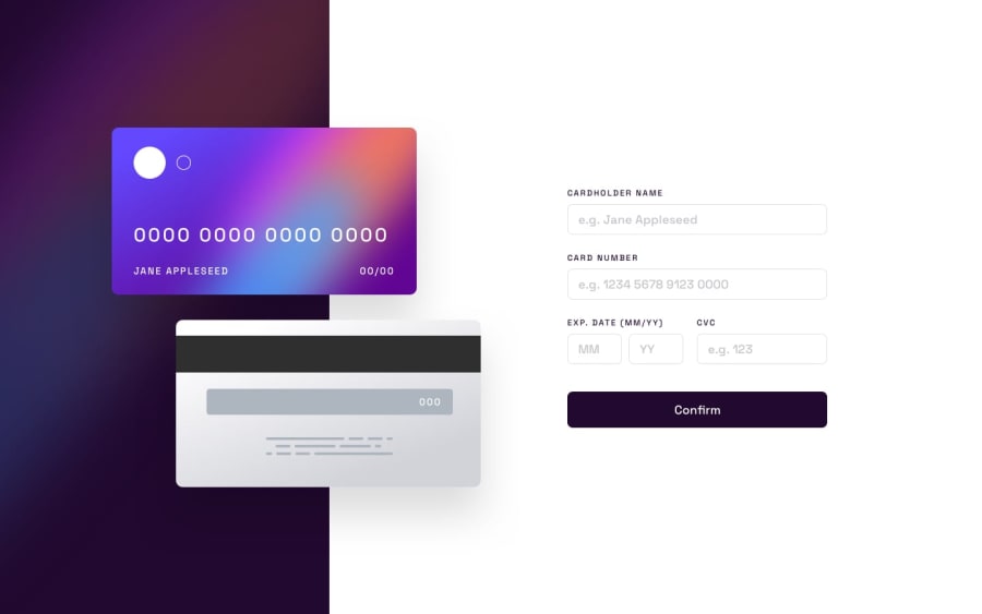
Design comparison
Solution retrospective
NOTE : ⚠️ Since it's a project on card details, it's flagged by Google as a malicious website, just ignore and visit site still, inputting "dummy" details to test ⚠️
Thank you.
Community feedback
- @code-AllahtosinPosted about 2 years ago
Hello, I just previewed your site, the site breaks between width of 600px and 1000px; I suggest you manage this.
Also, sub 1130px width, the card input goes behind the card. I suggest you use a min-width in your body to prevent this.
Marked as helpful0 - @LooceePosted about 2 years ago
Hi, i couldn't preview your site. I think you should rename your repository or url so it can be accessed. Try adding a name that doesn't contain the word "card", so we can access it.
Marked as helpful0@Zeuhz-DroidPosted about 2 years ago@Loocee Already altered the site's name. It should be pretty much accessible right now. Thank you for the feedback.
0
Please log in to post a comment
Log in with GitHubJoin our Discord community
Join thousands of Frontend Mentor community members taking the challenges, sharing resources, helping each other, and chatting about all things front-end!
Join our Discord
