Design comparison
Community feedback
- @AdrianoEscarabotePosted about 2 years ago
Hi Elena Annibali, how are you?
I really liked the result of your project, but I have some tips that I think you will enjoy:
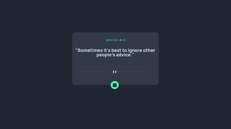
- every Html document must contain the main tag, so we can identify the main content, to fix this, wrap all the content with the main tag. HTML5 landmark elements are used to improve navigation experience on your site for users of assistive technology.
- To align some content in the center of the screen, always prefer to use
display: flex;it will make the layout more responsive!
Example:
body {
    margin: 0;
    padding: 0;
    display: flex;
    align-items: center;
    justify-content: center;
    min-height: 100vh;
}
The rest is great!
I hope it helps... 👍
0 - @EmanueleGuriniPosted about 2 years ago
Elena, pay attection on Firefox because some browsers caching the data from a specific server, and in this case Firefox detects that you are sending the request to same end-point, and he try to give you back the data in a faster way sending back the data that your already got before.
As you know, when you work with HTTP methods you can set many info inside your request (https://developer.mozilla.org/en-US/docs/Web/API/Request/cache), so in that case you need to tell to your browser that you don't want to cache the data: fetch(url, { cache: "reload" })
0
Please log in to post a comment
Log in with GitHubJoin our Discord community
Join thousands of Frontend Mentor community members taking the challenges, sharing resources, helping each other, and chatting about all things front-end!
Join our Discord
