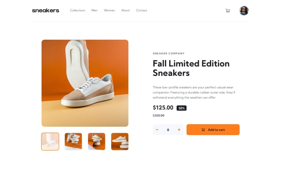
Design comparison
Solution retrospective
Using react for the first time so the code is very messy any feedback is welcome
Community feedback
- @AlexKMarshallPosted about 3 years ago
It looks as though you've not uploaded the source code to the repo, only the build folder, so I can't really comment on the React code.
But, I'm glad that you've real buttons for the interactive elements, that's often something people forget to do when first starting work with React.
The modal for the shopping cart also closes when clicking outside of it, which is a good touch that is often missing too. For accessibility the cart open icon should also be in a button so it can be used with a keyboard, and when the cart is open, focus should be moved to the cart and kept within the modal. The rest of the app should be hidden from screen readers with
aria-hiddenwhile the cart is open. That's a lot of things to keep track of manually, and easy to get wrong, so I would usually suggest using something like https://reach.tech/dialog/ which takes care of all of the accessibility issues for you, and leaves you to style it however you like.I'd love to be able to take a look at the code properly, but for a first time using React, this looks like you've done an excellent job, well done.
Marked as helpful1@Hukumchand-NarwrePosted about 3 years agoHii @AlexKMarshall ,
Thank you for your valuable feedback. I have updated my solution with the source code. Next time definitely I will try to improve the code.
0
Please log in to post a comment
Log in with GitHubJoin our Discord community
Join thousands of Frontend Mentor community members taking the challenges, sharing resources, helping each other, and chatting about all things front-end!
Join our Discord
