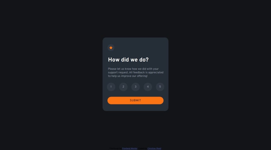
Design comparison
Solution retrospective
How I figured out how to change the card to the thank you card.
What challenges did you encounter, and how did you overcome them?It was quite a challenge to figure out how to change the card to the thank you card. Overcame this by following a tutorial on freeCodeCamp.
Also the rating numbers changing colors when clicked was a challenge. Overcame this by using ChatGPT to help point me in the right direction. However I feel like I cheated by doing so.
What specific areas of your project would you like help with?Whatever feedback there is, it's always appreciated.
Community feedback
- @Rahmonbek-0001Posted 5 months ago
Very cool site Christian Reed. But I have to tell you your mistakes because I am a web designer. Your mistakes are not getting the "weight" right and not paying enough attention to the colors. Except for these errors, your site is perfect
1@ReedorReedPosted 5 months ago@Rahmonbek-0001 Thank you very much for your feedback! It’s deeply appreciated! I also thought it was looking off. But I used the weight and colors described in the design files. I will see if I can make it more accurate :-)
0
Please log in to post a comment
Log in with GitHubJoin our Discord community
Join thousands of Frontend Mentor community members taking the challenges, sharing resources, helping each other, and chatting about all things front-end!
Join our Discord
