Design comparison
Solution retrospective
Please feel free to leave a comment below. Thanks~
Community feedback
- @elaineleungPosted over 2 years ago
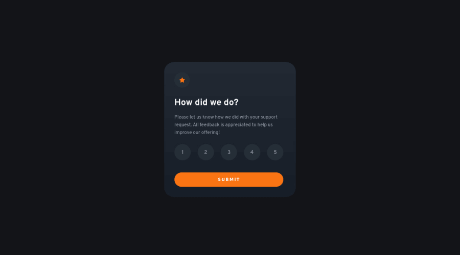
Hi CY, well done building this rating component in React! Everything works well, and good job in handling what happens when nothing is selected. I think you also did well using radio buttons for the job because that is perhaps the best choice for screen reader users; the only thing about that is, because your radio buttons have a
display: none, screen reader users still won't be able to use them since the radios are hidden from the browser and therefore cannot be used with the tab key. As a "level up" challenge, you can look into how to make the component a more inclusive app for screen reader users and adding focus styles as well, since catering to accessibility needs is a huge part of web development! If you're interested, you can check out my solution for this challenge as I also used radio buttons and have made them usable with a tab key.0
Please log in to post a comment
Log in with GitHubJoin our Discord community
Join thousands of Frontend Mentor community members taking the challenges, sharing resources, helping each other, and chatting about all things front-end!
Join our Discord
