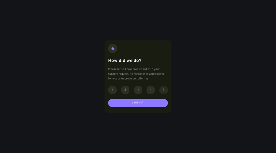
Rating Component | BEM, Animation, JS
Design comparison
Solution retrospective
Feel free to leave feedback and help me improve my code structure or even the solution!
Hi there! This is my attempt at the Rating Component with Frontend Mentor. After a few days learning with Scrimba and taking the advanced Javascript course, I feel way more confident to write structural and clean JS code and managing state.
This is what I practicing(feeling like a revision after a week or so didn't touch FM):
BEM naming convention Simple animation and transition(icon spinning effect, and staggering fade in effect) Using hue rotate, a value of the CSS filter property to give the design a slightly different touch
Happy Coding everyone :D
Community feedback
Please log in to post a comment
Log in with GitHubJoin our Discord community
Join thousands of Frontend Mentor community members taking the challenges, sharing resources, helping each other, and chatting about all things front-end!
Join our Discord
