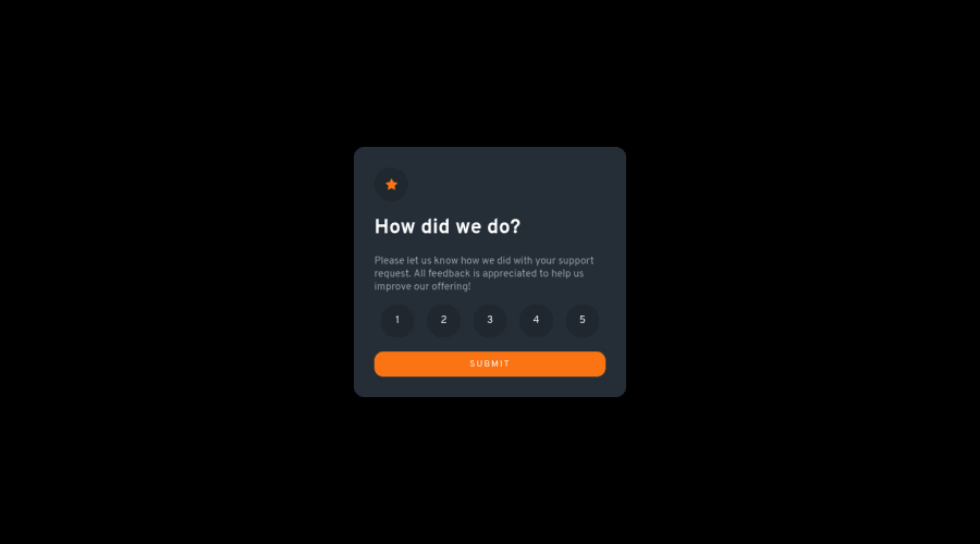
Design comparison
SolutionDesign
Solution retrospective
Any suggestions are welcome!
Community feedback
- @correlucasPosted about 2 years ago
👾Hello @VanessaAz, Congratulations on completing this challenge!
Great code and great solution! I’ve few suggestions for you that you can consider adding to your code:
To improve the card overall responsibility, you can start to add
flex-wrapinside the class that manages the section for therating numbers buttonand makes the adjust to fit in different rows while the container scales down, not that without this property the container doesn't shrink. Here's the code applying these changes:#rating-btn { display: flex; justify-content: space-around; cursor: pointer; flex-wrap: wrap; }✌️ I hope this helps you and happy coding!
Marked as helpful0
Please log in to post a comment
Log in with GitHubJoin our Discord community
Join thousands of Frontend Mentor community members taking the challenges, sharing resources, helping each other, and chatting about all things front-end!
Join our Discord
