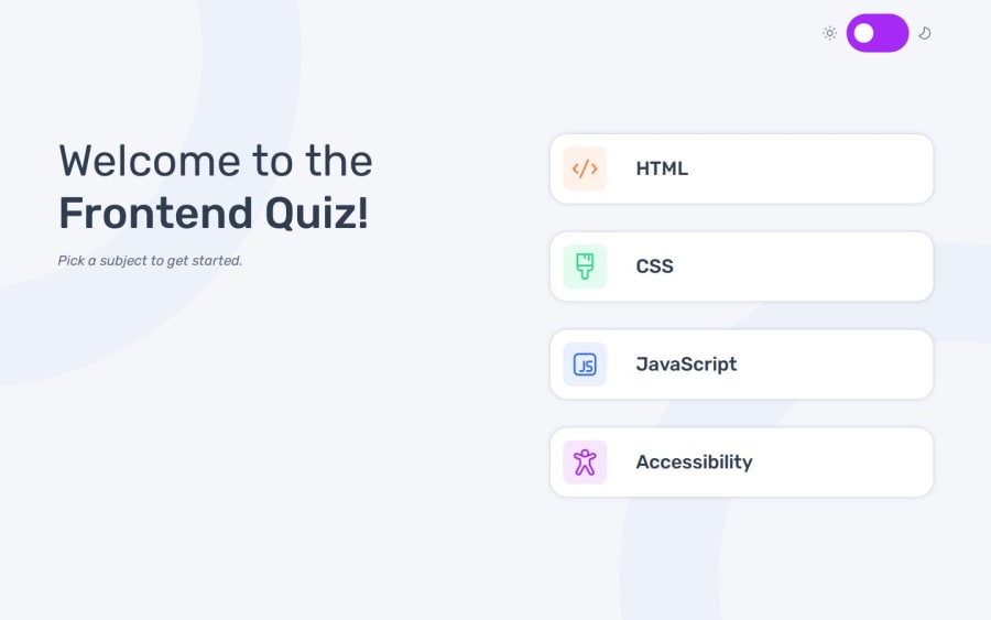
Quiz web-app using SCSS, vanilla JS
Design comparison
Solution retrospective
This time I did the design through figma file, which was different from the way I used to approach working with Frontend mentor projects. In general, the work on this project felt more serious from that and more interesting. Next time I'd like to write more organized JS and go deeper into the basics before I start using some frameworks, which I'd like to do in the near future.
What specific areas of your project would you like help with?For some reason, the option items shrink in height when they are highlighted. This problem occurred late in development and I don't think I've had it before. I've also tried to make the quiz more accessible, but there are still some weird bugs when using the screen reader and keyboard navigation. Some tips are appricieted !
Note: to see the site better, zoom out a bit. I followed the typescale provided in the figma file.
Community feedback
Please log in to post a comment
Log in with GitHubJoin our Discord community
Join thousands of Frontend Mentor community members taking the challenges, sharing resources, helping each other, and chatting about all things front-end!
Join our Discord
