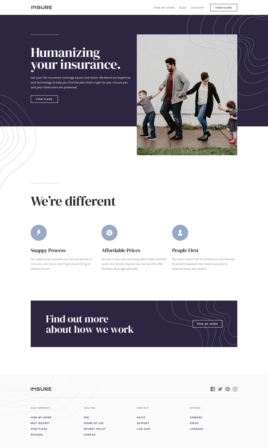
Design comparison
SolutionDesign
Solution retrospective
All good, except the overlapping backgrounds and the hamburger wrap for the mobile section. Could not do it.
Community feedback
- @rfilenkoPosted over 4 years ago
Hey Abigail, to fix your issues:
- don't set width on .nav-buttons
- also it's better not to define width on container with vw unit (100vw creates overflow);
- multiple images can be used on background property, position can be also set. Besides this, really great work. 😉
Cheers, Roman
0@maenadPosted over 4 years ago@rfilenko Thanks a lot for the input! I will try to improve in next challeenges!
0
Please log in to post a comment
Log in with GitHubJoin our Discord community
Join thousands of Frontend Mentor community members taking the challenges, sharing resources, helping each other, and chatting about all things front-end!
Join our Discord
