Not Found
Not Found
Not Found
Not Found
Not Found
Not Found
Not Found
Not Found
Not Found
Not Found
Not Found
Not Found
Not Found
Not Found
Not Found
Not Found
Not Found
Not Found
Not Found
Not Found

Submitted

Quick QR code component solution

Aron Snekkestadβ€’ 110

@aronsn

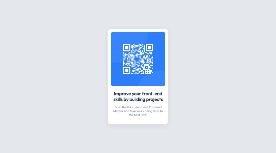
Desktop design screenshot for the QR code component coding challenge

This is a solution for...

  • HTML
  • CSS
1newbie
View challenge

Design comparison


SolutionDesign

Solution retrospective


Did not spend too much time building this one out. But I am not perfect and will appreciate any good feedback to progress my front-end fundementals!

Please let me know if there is anything I have forgotten to do here.

Thanks

Community feedback

@MelvinAguilar

Posted

Hello there πŸ‘‹. Good job on completing the challenge !

I have some suggestions about your code that might interest you.

CSS 🎨:

  • Instead of using pixels in font-size, use relative units like em or rem. The font-size in absolute units like pixels does not scale with the user's browser settings. Resource πŸ“˜.
  • You should use the box-sizing: border-box property to make the width and height properties include the padding and border of the element. This will make it easier to calculate the size of an element. You can read more about this here πŸ“˜.
  • Use min-height: 100vh instead of height. Setting the height to 100vh may result in the component being cut off on smaller screens, such as a mobile phone in landscape orientation.

CSS Reset πŸ”„:

  • You should use a CSS reset. A CSS reset is a set of CSS rules that are applied to a webpage in order to remove the default styling of different browsers.

    CSS resets that are widely used:

I hope you find it useful! πŸ˜„

Happy coding!

Marked as helpful

2

Aron Snekkestadβ€’ 110

@aronsn

Posted

Hey @MelvinAguilar, many thanks for gold feedback!

I applied these changes and have made a new deploy. Will be doing from now on!

Feel free to check out the solution now. I think it looks much more similar to design than before.

Best, Aron

0
Daniel πŸ›Έβ€’ 44,230

@danielmrz-dev

Posted

Hello @fuzzboii!

Your solution looks great!

I have just one suggestion:

  • I think there are more tags than necessary on this one. You used main, article and a div. Unless you have a specific reason for that, you could've used just the main tag, since the card is all we have on the page.

The <article> tag would make more sense if the card was part of a bigger website (it certailny would in real world).

I hope it helps!

Other than that, you did an excellent job!

Marked as helpful

1

Aron Snekkestadβ€’ 110

@aronsn

Posted

Hey @danielmrz-dev,

That makes sense. Your right. I think was making things much more difficult for myself than it should be.

Thank you for pointing this out! I have deployed the new changes.

Best, Aron

1

Please log in to post a comment

Log in with GitHub
Discord logo

Join our Discord community

Join thousands of Frontend Mentor community members taking the challenges, sharing resources, helping each other, and chatting about all things front-end!

Join our Discord