Design comparison
SolutionDesign
Community feedback
- @lank81Posted 5 months ago
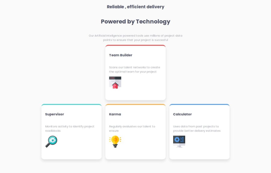
You have the overall layout down.
One thing to look out for is the font-weight of each area. The top line and the paragraphs are a font-weight of 200.
Another easy fix is adding float: right to your img tags. This allows the image to be on the bottom right, instead of the left.
0
Please log in to post a comment
Log in with GitHubJoin our Discord community
Join thousands of Frontend Mentor community members taking the challenges, sharing resources, helping each other, and chatting about all things front-end!
Join our Discord
