Design comparison
Community feedback
- @VCaramesPosted about 2 years ago
Hey @huey-io, some suggestions to improve you code:
- To give you HTML code structure, you want to set up your code in the following manner (only did parent containers):
  <body>
    <main>
      <article class="card-container”>
      </article>
    </main>
  </body>
The Main Element identifies the main content of the document.
While the Article Element will serve as the card’s container, because the card represents a complete, or self-contained, section of content that is, in principle, independently reusable.
More info:
https://web.dev/learn/html/headings-and-sections/
-
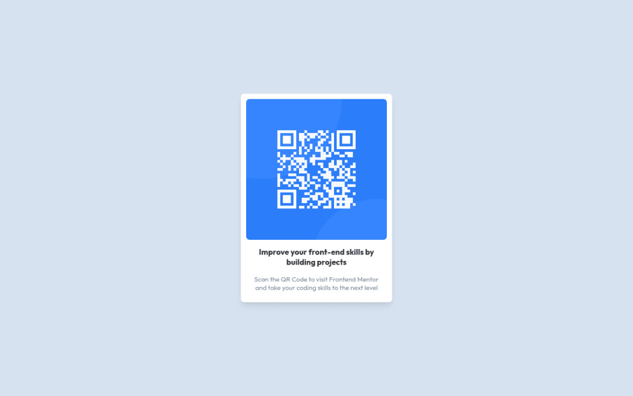
The Alt Tag description for the QR image needs to be improved upon. Its needs to tell screen reader users what it is and where it will take them to when they scan it.
-
Change the
widthtomax-widthin your card container to make it responsive. -
Delete the following, it is not needed:
.container {
    box-sizing: border-box;
    background: hsl(220, 15%, 55%);
    position: absolute;
    font-size: 16px;
    display: grid;
    height: 60%;
    width: 60%;
    color: red;
    z-index: 2;
}
Happy Coding! 👻🎃
0
Please log in to post a comment
Log in with GitHubJoin our Discord community
Join thousands of Frontend Mentor community members taking the challenges, sharing resources, helping each other, and chatting about all things front-end!
Join our Discord
