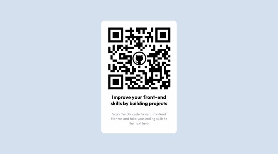
Design comparison
Community feedback
- @0xabdulkhaliqPosted almost 2 years ago
Hello there 👋. Congratulations on successfully completing the challenge! 🎉
- I have other recommendations regarding your code that I believe will be of great interest to you.
BODY MEASUREMENTS 📐:
- Use
min-height: 100vhforbodyinstead ofheight: 100vh. Setting theheight: 100vhmay result in the component being cut off on smaller screens.
- For example; if we set
height: 100vhthen thebodywill have100vhheight no matter what. Even if the content spans more than100vhof viewport.
- But if we set
min-height: 100vhthen thebodywill start at100vh, if the content pushes thebodybeyond100vhit will continue growing. However if you have content that takes less than100vhit will still take100vhin space.
.
I hope you find this helpful 😄 Above all, the solution you submitted is great !
Happy coding!
Marked as helpful1 - @apah-devPosted almost 2 years ago
Great work!
I noticed you didn't use the image provided in the images folder I'm guessing you either didn't see the file or you decided to be creative with the project and use your own image.
If you didn't see the images folder, it is downloaded with the project challenge and contains all the necessary images. There's also the styleguide.md which contains the fonts, font-weight, font-size, colors. I hope this helps
1
Please log in to post a comment
Log in with GitHubJoin our Discord community
Join thousands of Frontend Mentor community members taking the challenges, sharing resources, helping each other, and chatting about all things front-end!
Join our Discord
