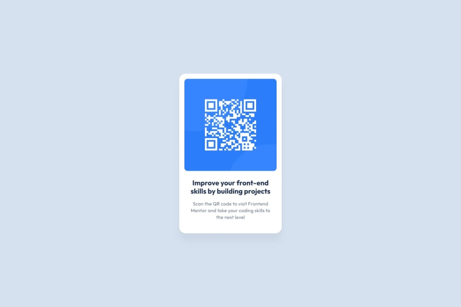
Design comparison
Solution retrospective
I'm pleased that I managed to get my project looking very close to the original image example
What challenges did you encounter, and how did you overcome them?I had trouble getting everything to size correctly with the rounded edges. I used a lot of trial and error to get things right, and I'm happy with the results
What specific areas of your project would you like help with?I would like help explaining how to change the sizes and shapes properly without making strange things happen to my site. Another thing I would like feedback on is if my site is properly responsive, and if not what changes do I need to make?
Community feedback
- @kodan96Posted 6 months ago
hi there! 🙌
few tips I packed up for you:
-
strange things happen when you specify
widthandheighton your elements, especially if you do it on containers. parent elements will adapt in size by default. -
instead of using px for font sizes you should use
remorem(you can look up the difference between the two). by using these, your font sizes will automatically adapt if you change thefont-sizeproperty in your:rootselector within@mediaqueries. -
you applied
overflow: hidden;to the image itself, but overflow supposed to be applied to the parent element. essentially overflow doesn't mean 'yeah, just hide my parts if it's overflowing the parent', but it means 'hide the child elements parts if they overflow my area'
Hope this was helpful 🙏
Good luck and happy coding! 💪
Marked as helpful1 -
- @danielmrz-devPosted 6 months ago
Hello there!
Congrats on completing the challenge! ✅
Your solution is really impressive!
I've got a couple of ideas (about how to use HTML better) that could make it even stronger:
📌 First: Think about using
<main>to wrap your main content instead of<div>.Imagine
<div>and<span>in HTML as basic containers. They're good for holding stuff, but they don't tell us much about what's inside or its purpose on the webpage.📌 Second: Consider using
<h1>for your main title instead of<h2>.It's more than just text size — it's about structuring your content effectively:
- The
<h1>to<h6>tags are used to define HTML headings. <h1>is for the most important heading.<h6>is for the least important heading.- Stick to just one
<h1>per page – it should be the main title for the whole page. - And don't skip heading levels – start with
<h1>, then use<h2>, and so on.
These tweaks might not change how your page looks, but they'll make your HTML code clearer and help with SEO and accessibility.
Hope that's helpful!
Keep up the great work!
0 - The
- @Jo-with-visionPosted 6 months ago
Hi,
Well done on completing the challenge!
In addition to the above - you could consider refactoring your code to:
-
include all your styles in an external stylesheet and connect it to your html file correctly using a
<link>element inside the<head>section of your index.html. You have a stylesheet called styles.css that is not currently connected to your HTML. -
Delete fontstyle.css from your repo as it does not contain valid CSS and the file is redundant. You can link to the fonts of your choice via a
<link>element in the head section of your index.html or via@importin your CSS. I can see you are already linking to the Google Font 'Outfit' in your index.html. -
Tidy up your repo further by removing files and folders you don't need such as the original README template that you are not using and the design folder. (optional step for organisation).
Happy Coding ✨
0 -
Please log in to post a comment
Log in with GitHubJoin our Discord community
Join thousands of Frontend Mentor community members taking the challenges, sharing resources, helping each other, and chatting about all things front-end!
Join our Discord
