Not Found
Not Found
Not Found
Not Found
Not Found
Not Found
Not Found
Not Found
Not Found
Not Found
Not Found
Not Found
Not Found
Not Found
Not Found
Not Found
Not Found
Not Found
Not Found
Not Found

Submitted

QR-component done using HTML/CSS

Bryan 130

@MamieNorris

Desktop design screenshot for the QR code component coding challenge

This is a solution for...

  • HTML
  • CSS
1newbie
View challenge

Design comparison


SolutionDesign

Solution retrospective


Hey guys,

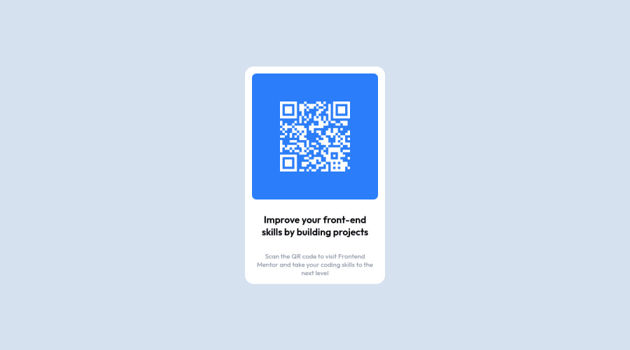
I was wondering is there anyway to place all the different elements (image, title, paragraph) inside my main container without using flexbox>flex-direction:column ? My issue is that I always end up with spaces between the elements that I can't remove or even manipulate. I guess we could make the main container position relative and the childs position absolute but it seems tedious.. Is there any better solution ?

Thanks for having a look !

Community feedback

Lucas 👾 104,420

@correlucas

Posted

👾Hello Bryan, congratulations for your new solution!

Your solution is already perfect with flexboxI don't really think you need to change it but if you want. You can use GRID if you prefer as an alternative for flexbox even if flex is the best choice for this challenge, see the modifications I did to you code bellow:

.main-container {
    display: grid;
    flex-direction: column;
    /* position: relative; */
    align-items: center;
    /* justify-content: space-around; */
    /* height: 497px; */
    padding: 15px;
    max-width: 320px;
    background-color: white;
    border-radius: 20px;
}

REMEMBER, if you want some component or container responsive ever use max-width or min-width if you use widththe container will not grow because width is a fixed a value and the other two options are flexible.

👾@correlucas rating for this solution: ⭐⭐⭐⭐⭐

👋 I hope this helps you and happy coding!

Marked as helpful

1

Bryan 130

@MamieNorris

Posted

@correlucas Thank you a lot Lucas for yor feedback ! I never use max/min-width but now I will.

1
PhoenixDev22 16,950

@PhoenixDev22

Posted

Hello Bryan,

Congratulation on completing this frontend mentor challenge. Excellent work! I have some suggestions regarding your solution:

  • In my opinion, the image is an important content. The alternate text should indicate where the Qr code navigate the user: like QR code to frontend mentor not describes the image.

There are some unnecessary div’s have to be removed for clean code.

  • Add min-height: 100vh instead of height: 100%to the body that let the body grows taller if the content outgrows the visible page instead.
  • width: 320px; an explicit width is not a good way to have responsive layout . consider using max-width to the card in rem instead .
  • height: 497px;It's not recommended to set height to component, let the content of the component define the height.
  • Using percentages for widths, using max-width and avoiding to set heights for the components, with these things is the key to mastering responsive layouts.
  • Consider using rem and em units as they are flexible, specially for font size better to use rem. If your web content font sizes are set in absolute units, such as pixels, the user will not be able to re-size the text or control the font size based on their needs. Relative units “stretch” according to the screen size and/or user’s preferred font size, and work on a large range of devices.
  • Remember a css reset on every project. That will do things like set the images to display block and make all browsers display elements the same.
The commented code should be removed.
/*You can add the flexbox properties and min-height to the body instead to center the component on the middle of the page.*/
body{
    display: flex;
    /* position: fixed; */
    /* top: 0; */
    /* bottom: 0; */
    /* right: 0; */
    /* left: 0; */
    align-items: center;
    justify-content: center;
    height: 100vh;
    width: 100%;
    background-color: #D5E1EF;
}

Overall, your solution is good. Hopefully this feedback helps.

Marked as helpful

1

Bryan 130

@MamieNorris

Posted

@PhoenixDev22 Thanks a lot man ! Your feedback is REALLY helpfull ! And yes I need to do some research to be more familiar with rem and em units since they're not very intuitive. But cheers, I'll dig into all of your advices !

1
PhoenixDev22 16,950

@PhoenixDev22

Posted

@MamieNorris Glad to help. Happy coding!

1
P
Ed 720

@EdwinSch

Posted

HTML renders in column direction by default. So if you don't want to use Flexbox properties you could choose to not apply Flexbox at all. Just create some spacing with margins between elements.

1

Please log in to post a comment

Log in with GitHub
Discord logo

Join our Discord community

Join thousands of Frontend Mentor community members taking the challenges, sharing resources, helping each other, and chatting about all things front-end!

Join our Discord