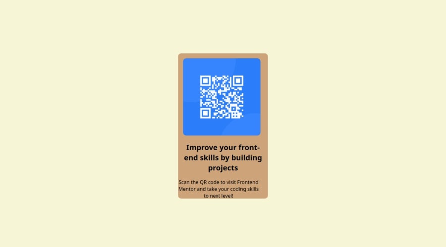
Design comparison
Solution retrospective
I am most proud of being able to put it together with CSS, and working around to make sure it is functional and easy to read! For the next time, I would like to educate myself a little more on how I could manipulate margin and padding around to help me!
What challenges did you encounter, and how did you overcome them?One of the challenges for me is Media Queries, and while this challenge did not require many, I hope for the next one I will be able to learn more on how it works!
What specific areas of your project would you like help with?I would like some help with fixing up the margin, or what I can apply that will make it easier to center the object, without changing a lot!
Community feedback
- @danielmrz-devPosted 6 months ago
Hello there!
Congrats on completing the challenge! ā
Your project is looking fantastic!
I'd like to suggest a way to make it even better:
- Using
margin
isn't always the most effective method for centering an element.
Here's a highly efficient approach to position an element at the center of the page both vertically and horizontally:
š Apply this CSS to the body (avoid using
position
ormargins
in order to work correctly):body { min-height: 100vh; display: flex; justify-content: center; align-items: center; }
I hope you find this helpful!
Keep up the excellent work!
Marked as helpful1@dimisleifPosted 6 months ago@danielmrz-dev
Thank you so much for your suggestions! I will be going back and fixing it up well :) For some reason, the first time I tried to center elements this way, it didn't work out quite well but I think I did not think to apply it to the body element!
I appreciate your suggestion and your comment, have a good day! :)
1 - Using
- @Alex-Archer-IPosted 6 months ago
Hi! Good work =)
For better centering you can get rid of
flex-wrap
of your.center
element and addflex-direction: column
rule. That way flex will arrange elements by Y axis.By the way - why did you use form tag for this work? Never saw something like this =)
Well, as I said, quite good work =) Good luck!
Marked as helpful0@dimisleifPosted 6 months ago@Alex-Archer-I
Hi, thank you so much for your comment! :)
Ooo, I will definitely apply this code and see what happens! Appreciate your suggestion a lot!
And as for the form tag, I had a tough time thinking what element would work for a project like this, and I did not want to use div element (as was suggested by David Gray) and a form tag seemed to be best? I'm still having a hard time connecting elements to where they should be applied, that's the only reason why :)
Thank you again for the kind words!
1@Alex-Archer-IPosted 6 months ago@dimisleif Glad I could help!
Well,
form
tag is not quite fitting here. It is a special tag which might contain fields likeinput
ortextarea
to collect some data from user.form
even have special attributes to configure request to send data to he server. In this project semantic tags likearticle
orsection
will be better approach =)It's all can seems overwhelming right now, but for sure you'll fell much more confidence with practice =)
Marked as helpful1@dimisleifPosted 6 months ago@Alex-Archer-I Aaaa, I see what you mean now!
I have made some edits of the code, used what you suggested and it worked very well!! :)
1@Alex-Archer-IPosted 6 months ago@dimisleif Cool!
But I see that you (probably, by accident) added
display: flex
andflex-direction
properties toimg
tag. They won't make any changes there asimg
haven't child elements. Move them to.center
and don't forget aboutalign-items: property
=)That's great that you try to improve your code =)
Marked as helpful1
Please log in to post a comment
Log in with GitHubJoin our Discord community
Join thousands of Frontend Mentor community members taking the challenges, sharing resources, helping each other, and chatting about all things front-end!
Join our Discord