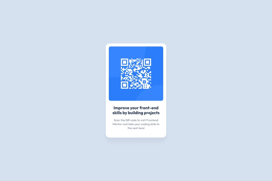
Design comparison
Solution retrospective
This is to improve my styling skills kindly give me a feedback with clean code if possible.
Community feedback
- @eaakrePosted over 1 year ago
The mobile version of this needs a little work. The design looks good on a very specific size screen. But once that screen size changes, the text on the bottom acted a little funky. Being that the qr-code should probably stay the same size whether on mobile or desktop, and it should be in the center of the screen. With that knowledge, I would use more specific heights and widths. I would make these changes to your CSS:
Move the background color to the body element: body{ background-color: rgba(213,225,239,255); }
Add this to the '.mainContent' div style: position: absolute; left: 50%; top: 50%; transform: translate(-50%, -50%); (change height to 80vh as well - or perhaps to 'max-height': 500px;) (remove margin attribute here too)
Use a max-width attribute in both the '.contentBox' div and '.content2' div. I would use something like: max-width: 300px;
I also would remove the width attribute on the '.mainContent', '.contextBox' divs
Lastly, change the padding on the .Content1 div to: padding: 25px;
1
Please log in to post a comment
Log in with GitHubJoin our Discord community
Join thousands of Frontend Mentor community members taking the challenges, sharing resources, helping each other, and chatting about all things front-end!
Join our Discord
