Not Found
Not Found
Not Found
Not Found
Not Found
Not Found
Not Found
Not Found
Not Found
Not Found
Not Found
Not Found
Not Found
Not Found
Not Found
Not Found
Not Found
Not Found
Not Found
Not Found

Submitted

Qrcode-Frontend-Mentor

@guihenriquedev

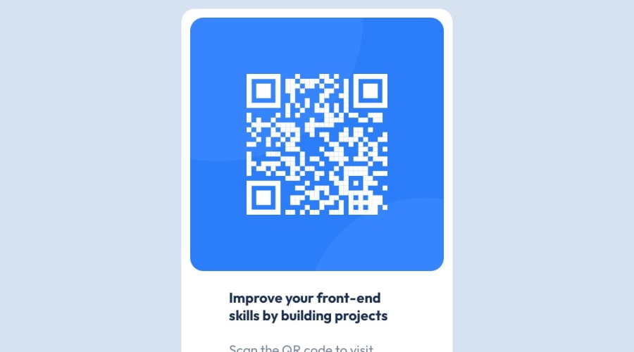
Desktop design screenshot for the QR code component coding challenge

This is a solution for...

  • HTML
  • CSS
1newbie
View challenge

Design comparison


SolutionDesign

Solution retrospective


The thing that i found difficult is to make a responsive website. I don't make responsive website so good yet, but I think this project helps me a lot, to make a good responsive site. I am unsure of my css code, however I'm practicing a lot. How do you guys make your site responsive ?

Community feedback

Chriscent Pingolβ€’ 230

@KishonShrill

Posted

Hello there πŸ‘‹πŸ˜‰ I can't help notice about the fact that your component is overflowing vertically πŸ₯²πŸ₯Ή, let me help you in that aspect:

1.) To fix your overflow, don't forget to add your width and height

body {
   width: 100%;
   height: 100vh; // or 100%

   // Other components
}
main {
   width: 100%;
   height: 100vh; // or 100%

   // Other components
}

2.) I have noticed that your usage of flexbox has also contributed on the overflow, although I am not particularly an expert of flexbox but using flex-direction: column instead of flex-flow: column wrap should be enough. 😲 "Wrap" happens when the element inside is much bigger than the container, since your <p> is bigger that the container without a "width" then it would result into an overflow. Instead, use 100% on the <p> element so it will only have a width that's as big as the container can contain:

main {
   width: 100%;
   height: 100vh; // or 100%
   display: flex;
   flex-direction: column;

   // Other components
}
main p {
   width: 100%;

  // Other components
}

3.) Last, since the texts in the design needs to be centered, use text-align: center; 😁

main h1 {
  color:  hsl(218, 44%, 22%);
  font-weight: 700;
  width: 100%;

   text-align: center;
}
main p {
   color: hsl(220, 15%, 55%);
   width: 100%;
   font-size: 30px;
   font-weight: 400;

   text-align: center;
}

There are still a lot I can point out but I know for now this is already great progress you have here 😁 well done πŸŽ‰πŸŽŠ Trust the process🎯.

To know more about responsive layouts, check Responsive Web Design Media Queries

Marked as helpful

1

Please log in to post a comment

Log in with GitHub
Discord logo

Join our Discord community

Join thousands of Frontend Mentor community members taking the challenges, sharing resources, helping each other, and chatting about all things front-end!

Join our Discord