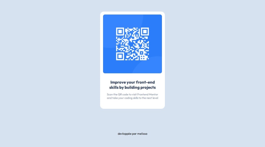
Design comparison
Solution retrospective
It's my first try on frontend development, all comments are welcomed !
Community feedback
- @HeyChobePosted 10 months ago
Hello Melissa 👋
Congrats! To be your first frontend development It was a very nice job. I think you achieved very well the shape of the card.
There are some margins/paddings to adjust to be equal to the solution proposed, but essentially yo did it very well.
For the next challenges, I highly recommend to you to use the design images provided by the challenge and try to compare the exactly size of components, just for layout purposes.
Keep improving, you're on the right track.
Marked as helpful1 - @danielmrz-devPosted 10 months ago
Hello @Melissa-Sadeg!
Your solution looks great!
I have a suggestion for improvement:
- For semantic reasons, use
<main>to wrap the main content instead of a<div>. The tag<div>has no semantic value.
📌 This tag change does not impact your project visually and makes your HTML code more semantic, improving SEO optimization as well as the accessibility of your project.
I hope it helps!
Other than that, great job!
Marked as helpful0 - For semantic reasons, use
- @ZukizukPosted 10 months ago
Hello @name!
Your solution looks great for your first time. Keep it up!
I have few suggestions that i think might interest you.
- HTML: Consider using semantic HTML tags like
<main></main>and others that you can find more here in this link. And in this case, replace the<div class="bordure">with<main class="bordure">. The main tag should hold the main content of the page so consider correcting that.The semantic HTML tags help the search engines and other user devices to determine the importance and context of web pages. The pages made with semantic elements are much easier to read. It has greater accessibility. It offers a better user experience. <div></div> have no semantic value so using it when there's a better option is not helpful.
Also, you solution is not responsive, which makes it look not that great on mobile device. You can use media queries to make a page responsive. You can start by doing the mobile design first and then using media queries to style the desktop design like you had done. Example
@media (min-width: 1024px) {
  /*You define your desktop styles here */
}
With the example above, whatever styles you define in the media queries will be applied when it reaches the specified device width in the media query. You can learn more about media queries heremedia queries
I hope this solution is helpful
Other than that, you did a great job!
Marked as helpful0 - @ChamuMutezvaPosted 10 months ago
Hi Melissa-Sadeg
Congratulations on your first challenge. Here are a few points that you can have a look at
- a site should be made up of Landmark region (elements), generally you need to have the
mainlandmark element in this challenge. Find out more about landmark regions here - get a formatter to format your code for readability
- it is important to have your font sizes in rems , using px values is not recommended as px are not responsive. The following article will brief you more on Why font-size must NEVER be in pixels
- on the class
.bordure, you are using explicit sizes likewidth: 320px;andheight: 497px;. This will have responsive issues in some case, for example you will note that below 320px , the size will not be viewed in full. I would usemax-widthas that would allow the component to a certain maximum width. For the height of the component, let the elements decide how tall the component should be .
Marked as helpful0 - a site should be made up of Landmark region (elements), generally you need to have the
Please log in to post a comment
Log in with GitHubJoin our Discord community
Join thousands of Frontend Mentor community members taking the challenges, sharing resources, helping each other, and chatting about all things front-end!
Join our Discord
