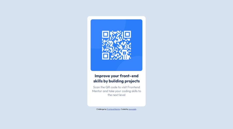
Design comparison
Solution retrospective
improvement of the css code
What challenges did you encounter, and how did you overcome them?i was not familiar with flex
What specific areas of your project would you like help with?is there a better way to write the code and name the css classes
Community feedback
- @Ezekiel225Posted about 1 year ago
Hello there 👋 @awwsalah.
Good job on completing the challenge !
Your project looks really good!
I have suggestions about your code that might interest you.
📌 First: Use
<main>to wrap the main content instead of<div>.Tags like
<div>and<span>are typical examples of non-semantic HTML elements. They serve only as content holders but give no indication as to what type of content they contain or what role that content plays on the page.📌If you don't have the Figma design files, I recommend using a browser extension called Perfect Pixel.
It allows you to compare your finished project with the design images that come along when you download the project and check the (almost exact) dimensions. It's very useful!
I hope this suggestion is useful for future projects.
Other than that, great job!
Keep up the excellent work and continue to challenge yourself with new projects. Your progress is impressive, and each project is a step forward in your front-end development journey! 🚀🌟.
Happy coding.
Marked as helpful0@awwsalahPosted about 1 year ago@Ezekiel225 thanks again. i change the div to main. but i like to ask you question what is {All page content should be contained by landmarks} what does it mean
0
Please log in to post a comment
Log in with GitHubJoin our Discord community
Join thousands of Frontend Mentor community members taking the challenges, sharing resources, helping each other, and chatting about all things front-end!
Join our Discord
