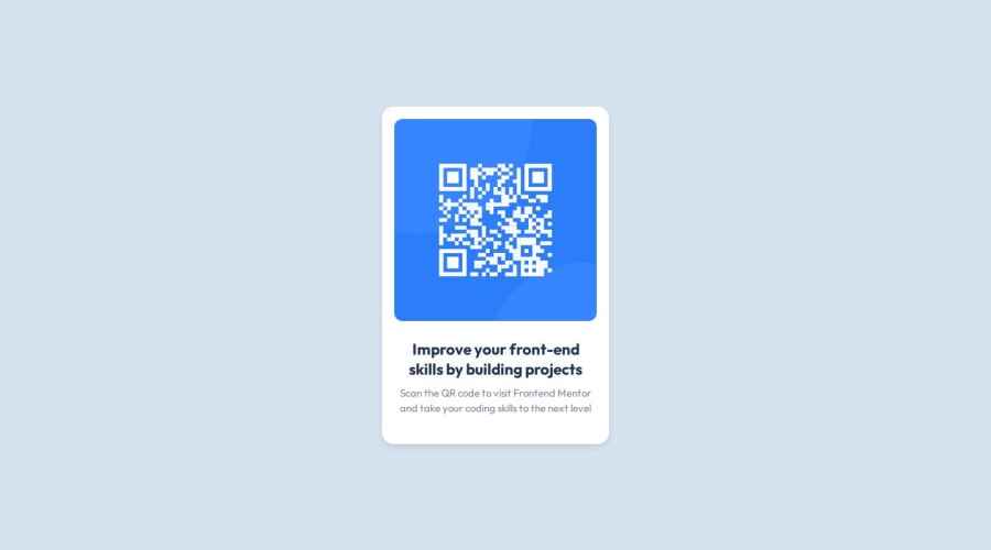
Design comparison
Solution retrospective
I'm most proud of how I implemented the responsive design for the QR code component using CSS and HTML. Achieving a layout that looks great on various screen sizes was a rewarding challenge. I'm particularly pleased with how I used Flexbox to structure the card layout and ensure the QR code image scales appropriately.
Next time, I would approach the project with a more structured plan from the outset. While I learned a lot through trial and error, having a clearer wireframe or mockup before diving into coding would streamline the development process. Additionally, I'd like to explore incorporating more advanced CSS features like CSS Grid for layout, which could offer even more flexibility and control over the design.
Overall, completing this project has boosted my confidence in front-end development, and I'm excited to apply these learnings to future projects!
What challenges did you encounter, and how did you overcome them?During the process of completing the QR code component project, I encountered several challenges that tested my problem-solving and coding skills. Here are some of the challenges I faced and how I overcame them:
Responsive Design Complexity: One of the main challenges was ensuring the QR code component looked good and functioned well across different screen sizes (desktop, tablet, mobile). I had to carefully consider layout adjustments and styling to maintain responsiveness.How I Overcame It: I used a mobile-first approach, starting with a basic layout for smaller screens and gradually adding styles and adjustments for larger screens using CSS media queries. Testing the design frequently on different devices and screen sizes helped me identify and fix layout issues promptly. QR Code Image Integration: Integrating the QR code image into the component while maintaining its responsiveness and aspect ratio was tricky.How I Overcame It: I used CSS techniques such as setting width: 100% and max-width properties on the image to ensure it scaled appropriately without distortion. I also applied border-radius to give the image a rounded appearance, which required careful adjustment to avoid clipping or stretching the QR code. CSS Styling Challenges: Achieving the desired visual appearance, such as rounded corners for the card and consistent typography, posed some challenges.How I Overcame It: I utilized CSS flexbox for the card layout and employed CSS properties like border-radius and box-shadow to enhance the visual presentation. Referring to CSS documentation and experimenting with different styles helped me achieve the desired look and feel. Accessibility and Alt Text: Ensuring the component was accessible, including providing meaningful alt text for the QR code image, was important but required attention to detail.How I Overcame It: I made sure to include descriptive alt text (alt="QR Code") for the image to assist users with screen readers and in cases where the image may not load. This is an essential accessibility practice that I learned and implemented during the project. In overcoming these challenges, I relied on resources such as documentation, online tutorials, and trial-and-error experimentation. Breaking down complex problems into smaller, manageable tasks and seeking feedback from peers or mentors also played a key role in overcoming hurdles effectively. Each challenge presented a valuable learning opportunity and contributed to my growth as a front-end developer.
What specific areas of your project would you like help with?While completing the QR code component project, there are specific areas where I would appreciate assistance or further guidance:
Optimizing CSS for Responsive Design: I would like help refining my CSS to ensure optimal responsiveness across various devices and screen sizes. This includes techniques for handling layout adjustments and styling nuances for different breakpoints. Accessibility Best Practices: I'm interested in learning more about accessibility and how to further enhance my project's accessibility features. Guidance on implementing ARIA attributes, improving keyboard navigation, and ensuring proper contrast for readability would be valuable. CSS Animation and Interactivity: Exploring ways to add subtle animations or interactive elements to the QR code component would be beneficial. I'm eager to learn techniques for incorporating engaging user experiences using CSS and possibly JavaScript. Code Refactoring and Best Practices: Reviewing my project for opportunities to refactor code and adopt best practices in HTML and CSS. This includes improving code organization, optimizing performance, and enhancing maintainability. Cross-Browser Compatibility: Understanding strategies to ensure compatibility with different web browsers and addressing any specific browser-related issues or inconsistencies encountered during testing. Deployment and Hosting: Guidance on deploying my project to a live environment and considerations for hosting, domain setup, or utilizing platforms like GitHub Pages or Netlify would be helpful for showcasing my work. By receiving assistance and insights in these areas, I aim to strengthen my skills as a front-end developer and elevate the quality of my projects. Any tips, resources, or recommendations related to these topics would be greatly appreciated!
Community feedback
Please log in to post a comment
Log in with GitHubJoin our Discord community
Join thousands of Frontend Mentor community members taking the challenges, sharing resources, helping each other, and chatting about all things front-end!
Join our Discord
