Not Found
Not Found
Not Found
Not Found
Not Found
Not Found
Not Found
Not Found
Not Found
Not Found
Not Found
Not Found
Not Found
Not Found
Not Found
Request path contains unescaped characters
Not Found
Not Found
Not Found

Submitted

qr-code-component-main

HannTosin 30

@HannTosin

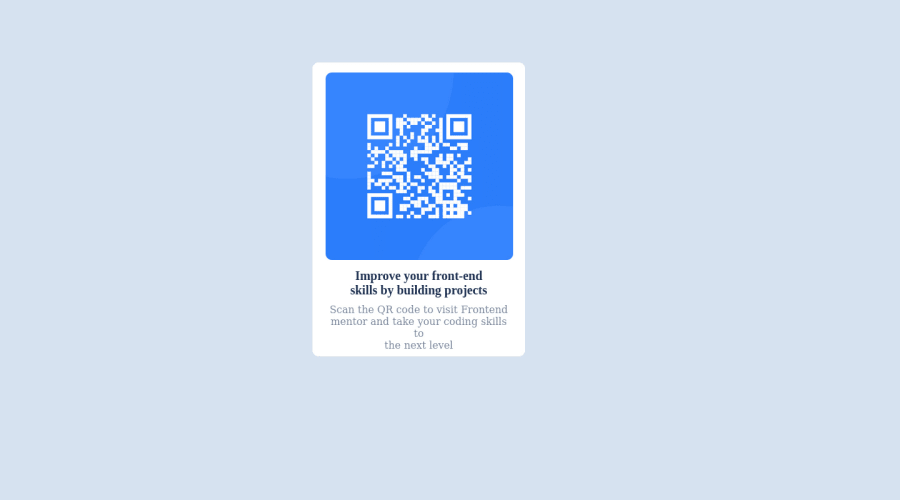
Desktop design screenshot for the QR code component coding challenge

This is a solution for...

  • HTML
  • CSS
1newbie
View challenge

Design comparison


SolutionDesign

Solution retrospective


I had a great experience while building this project. However, I had a bid of difficulty is using the CSS media query syntax to make the page responsive when opened on a smaller device. I read materials and CSS documentation, but I still didn't get a hang of it. I would appreciate it if someone can put me through on the use of CSS media query in making a page responsive on smaller screens. Also, I would like to know the best practices when it comes to styling divs, items in a div, class and ids. how are they to be written in the CSS when styling.

Community feedback

Hassia Issah 50,670

@Hassiai

Posted

Replace <div id="body"> with the main tag and <h2> with <h1> to fix the accessibility issue. click here for more on web-accessibility and semantic html

For a responsive content which won't require a media query for this challenge, replace the width in #content with max-width, and give the img a max-width of 100% instead of an inline styling with a fixed width and height value.

There is no need to give #content a height value and position: relative and its properties.

There is no need to style #body give the background-color you gave to #body to the body.

To center #content on the page, add min-height:100vh; display: flex; align-items: center: justify-content: center; or min-height:100vh; display: grid place-items: center to the body.

To center #content on the page using flexbox:
body{
min-height: 100vh;
display: flex;
align-items: center;
justify-content: center;
}
To center #content on the page using grid:
body{
min-height: 100vh;
display: grid;
place-items: center;
}

Give h1 and p the same font-size of 15px and the same margin-left, margin-right and margin-top values. Give p a margin bottom value.

Use relative units like rem or em as unit for the padding, margin, width values and preferably rem for the font-size values, instead of using px which is an absolute unit. For more on CSS units Click here

Hope am helpful.

Well done for completing this challenge. HAPPY CODING

0

Please log in to post a comment

Log in with GitHub
Discord logo

Join our Discord community

Join thousands of Frontend Mentor community members taking the challenges, sharing resources, helping each other, and chatting about all things front-end!

Join our Discord