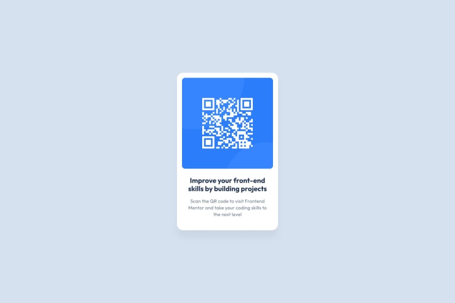
Design comparison
Solution retrospective
I'm most proud of how I was able to align the contents in the center of the web page which is something that I have struggled with.
What challenges did you encounter, and how did you overcome them?font color was a bit of challenge, also getting the right padding and margin values.
What specific areas of your project would you like help with?I would like help with the font color or opacity that was applied to it.
Community feedback
- @upbeatMoodPosted 7 months ago
I think it looks quite good. The code is easy to read and colors look fine too. The only thing I noticed is that the bold text look quite small compared to the one in the solution. Padding for that h1 content is too much, it pushes it inwards, making it smaller. Instead, you could wrap the text elements in a box and give that box a size of 80%. That way you could control where the text wraps from. Also consider using h3 or h4.
0
Please log in to post a comment
Log in with GitHubJoin our Discord community
Join thousands of Frontend Mentor community members taking the challenges, sharing resources, helping each other, and chatting about all things front-end!
Join our Discord
