Design comparison
SolutionDesign
Solution retrospective
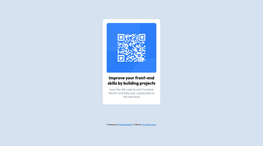
This is my the 3rd project. I use grid to put content in container. Looking forward to hear your tips & feedback, thanks!
Community feedback
- Account deleted
This comment was deleted over 1 year ago
1@0xabdulkhaliqPosted over 1 year ago@HassanAkhtar8 Brother please stop Plagiarism, it is strictly against frontend mentor community guidelines and it will lead to account ban and deletion.
Marked as helpful0 - @0xabdulkhaliqPosted over 1 year ago
Hello there 👋. Congratulations on successfully completing the challenge! 🎉
- I have other recommendations regarding your code that I believe will be of great interest to you.
HTML 🏷️:
- This solution lacks
semanticmarkup, which causes lacking of landmark for a webpage and allows accessibility issues to screen readers
- What is meant by landmark ?, They used to define major sections of your page instead of relying on generic elements like
<div>or<span>. They are use to provide a more precise detail of the structure of our webpage to the browser or screen readers
- For example:
- The
<main>element should include all content directly related to the page's main idea, so there should only be one per page - The
<footer>typically contains information about the author of the section, copyright data or links to related documents.
- The
- So fix it by replacing the
<div class="container">element with the semantic element<main>in yourindex.htmlfile to improve accessibility and organization of your page.
BODY MEASUREMENTS 📐:
- The
width: 100%property forbodyelement is not necessary. because it's a block level element which will take the full width of the page by default.
- Use
min-height: 100vhforbodyinstead ofheight: 100vh. Setting theheight: 100vhmay result in the component being cut off on smaller screens.
- For example; if we set
height: 100vhthen thebodywill have100vhheight no matter what. Even if the content spans more than100vh.
- But if we set
min-height: 100vhthen thebodywill start at100vh, if the content pushes thebodybeyond100vhit will continue growing. However if you have content that takes less than100vhit will still take100vhin space.
CSS 🎨:
- Looks like the component has not been centered correctly. So let me explain, How you can easily center the component without using
marginorpadding.
- We don't need to use
marginandpaddingto center the component both horizontally & vertically. Because usingmarginorpaddingwill not dynamical centers our component at all states
- To properly center the component in the page, you should use
FlexboxorGridlayout. You can read more about centering in CSS here 📚.
- For this demonstration we use css
Gridto center the component
body { min-height: 100vh; display: grid; place-items: center; }- Now remove these styles, after removing you can able to see the changes
.container {
  margin: 10rem auto;
}
- Now your component has been properly centered
.
I hope you find this helpful 😄 Above all, the solution you submitted is great !
Happy coding!
Marked as helpful0@tuaPuan83Posted over 1 year ago@0xAbdulKhalid Thank you so much for recommendation. It's very useful for me.
0
Please log in to post a comment
Log in with GitHubJoin our Discord community
Join thousands of Frontend Mentor community members taking the challenges, sharing resources, helping each other, and chatting about all things front-end!
Join our Discord
