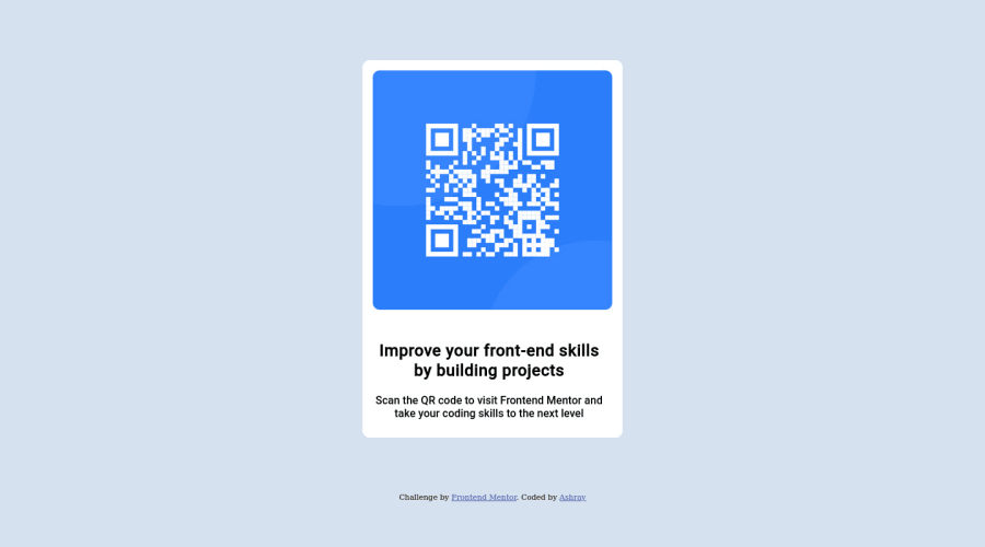
Design comparison
Solution retrospective
This was fairly easy for me. I found a lot of helpful critiques for my last post, especially the tip to use the <picture> instead of <img>. I will use it in my next challenge as I was already halfway through this challenge. I know it's not perfect but I don't want to exhaust myself trying to perfect every little detail. Looking forward to any helpful critique or tips for this one too. Thank you.
Community feedback
- @correlucasPosted about 2 years ago
👾Hi @RayAsh37, congratulations on your solution!👋 Welcome to the Frontend Mentor Coding Community!
Great solution and a great start! From what I saw you’re on the right track. I’ve few suggestions for you that you can consider adding to your code:
1.Add
<main>instead of<div>to wrap the card container. This way you show that this is the main block of content and also replace the div with a semantic tag.2.Replace the
<h2>containing the main title with<h1>note that this title is the main heading for this page and every page needs one h1 to show which is the most important heading. Use the sequence h1 h2 h3 h4 h5 to show the hierarchy of your titles in the level of importance, never jump a level.3.Clean your code by removing some unnecessary divs, most of the content can stand alone without a div. Use div only for blocks that need a special alignment or the content needs a special positioning.
4.Use relative units as
remoreminstead ofpxto improve your performance by resizing fonts between different screens and devices. These units are better to make your website more accessible. REM does not just apply to font size, but to all sizes as well.Here's my solution for this challenge if you wants to see how I build it: https://www.frontendmentor.io/solutions/qr-code-component-vanilla-cs-js-darklight-mode-nS2aOYYsJR
✌️ I hope this helps you and happy coding!
Marked as helpful0 - @VCaramesPosted about 2 years ago
Hey @RayAsh37, some suggestions to improve you code:
-
You content isnt responsive at all and the quality of you code needs to be improve upon. I suggest research on how to make content responsive and how to use Semantic HMTL.
-
Dont forget to add
min-height: 100vh;to the Body Element to center your content. -
Remove the following from your "Parent Container Class", your adding unnecessary code.
.parent-container { display: flex; flex-direction: column; height: 75%; align-self: center; margin-top: 5rem; }-
The
widthfrom the "Parent Container Class" has to bemax-widthto make the card responsive. -
The Background Image Property is only to be used on decorative images. NOT images that add value and serve a purpose. You want to implement the image using the Image Element.
-
Once you fix the image, you want to add an Alt Tag to it. Inside that Alt Tag Its needs to tell screenreader users what it is and where it will take them to when they scan it.
-
Once the picture stuff is done, you'll remove all of this:
.image-container { height: 350px; width: 350px; border-radius: 10px; margin: 15px; background-image: url('../images/image-qr-code.png'); background-position: center; background-repeat: no-repeat; background-size: cover; }- Your "Improve your front-end skill by building projects" needs to wrapped in an <h1> Heading. If this in a larger site with more cards, then the <h2> or <h3> Heading might be the better option.
Happy Coding!
Marked as helpful0 -
Please log in to post a comment
Log in with GitHubJoin our Discord community
Join thousands of Frontend Mentor community members taking the challenges, sharing resources, helping each other, and chatting about all things front-end!
Join our Discord
