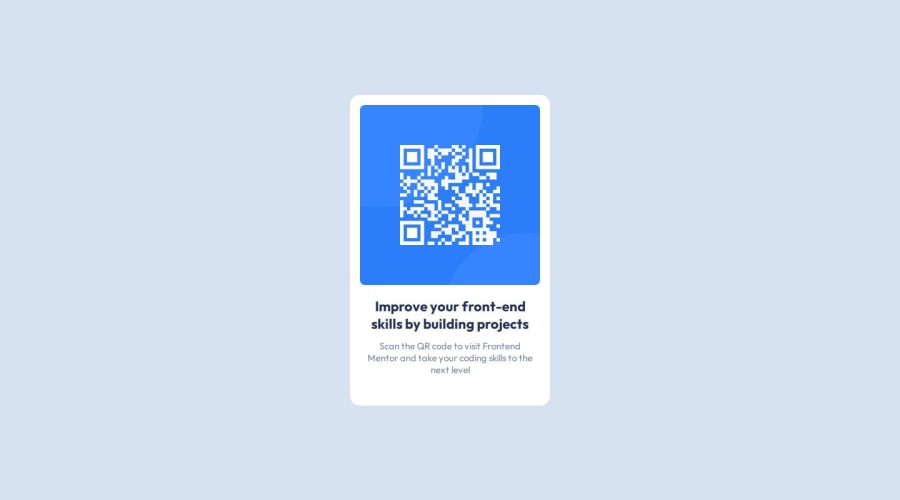
Design comparison
Solution retrospective
Finally finished the challenge. and I want to do responsive site next time
What challenges did you encounter, and how did you overcome them?I faced issue with margin space, then I realized that I have to set margin top to the img
What specific areas of your project would you like help with?how to find margin and padding space in a design?
Community feedback
- P@danielmrz-devPosted about 1 year ago
Hello @Mahendran-C!
Your solution looks excelent!
I have just one suggestion:
📌 To improve semantic clarity, opt for
<h1>over<h3>for your main title.It's more than just text size — it's about structuring your content effectively:
<h1>to<h6>are used to define HTML headings, with<h1>being the most significant.- Stick to one
<h1>per page for the main title, and maintain the titles hierarchy with<h1>,<h2><h3>, and so on.
While these adjustments might not alter the visual appearance much, they significantly enhance semantic clarity, SEO optimization, and accessibility.
Hope this suggestion proves helpful! Keep up the great work!
Marked as helpful2 - P@Islandstone89Posted about 1 year ago
HTML:
-
Remove
figure, it should be used when you have a<figcaption>, .i.e text under the image. -
The alt text should be written naturally, without using
-between the words. The alt text must also say where it leads(frontendmentor.io). -
Headings should always be in order, so you never start with a
<h3>. Change it into a<h1>. -
.attributionshould be a<footer>, and you should use<p>for the text inside.
CSS:
-
It's good practice to include a CSS Reset at the top.
-
Add around
1remofpaddingon thebody, so the card doesn't touch the edges on small screens. -
Remove the properties on
maintobody. Addflex-direction: column,gap: 2rem, and changeheighttomin-height- this way, the content will not get cut off if it grows beneath the viewport. -
Remove all widths and heights in
px. -
Add a
max-widthof around20remon the card, to prevent it from getting too wide on larger screens. -
font-sizemust never be in px. This is a big accessibility issue, as it prevents the font size from scaling with the user's default setting in the browser. Use rem instead. -
Since all of the text should be centered, you only need to set
text-align: centeron the body, and remove it elsewhere. The children will inherit the value. -
On the image, remove the margin, and add
display: blockandmax-width: 100%- the max-width prevents it from overflowing its container. -
I would double the
paddingon the card, from8pxto16px.
Marked as helpful1 -
Please log in to post a comment
Log in with GitHubJoin our Discord community
Join thousands of Frontend Mentor community members taking the challenges, sharing resources, helping each other, and chatting about all things front-end!
Join our Discord
