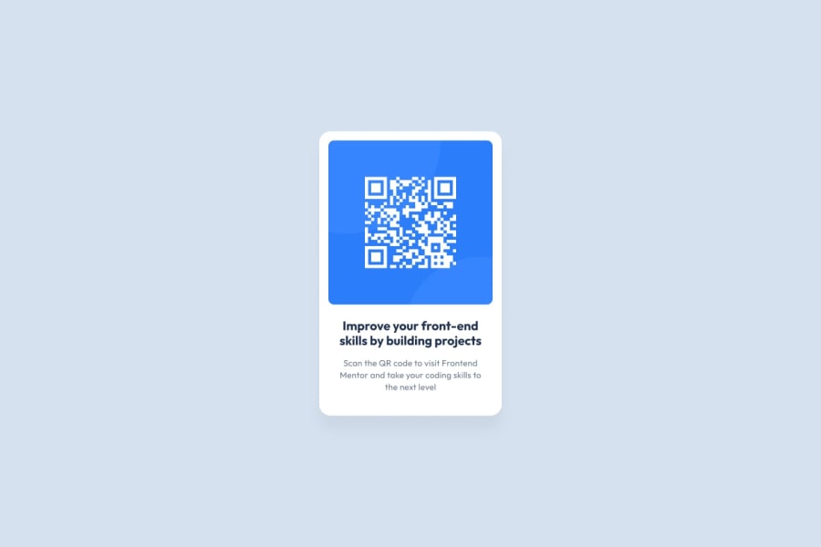
Design comparison
SolutionDesign
Community feedback
- @james-work-accountPosted over 2 years ago
This is a great start! Just some notes to improve:
- Missing box-shadow on the container
- You have skipped heading levels - there shouldn't be a h3 without a h2, there shouldn't be a h2 without a h1, etc. The h3 should be a h1 and re-styled if it is too big
<img>could do with an alt property - it is not obviously described by any other text on the page and isn't purely there for aesthetics- It would be good if the card was vertically centred
- Your container could be a main, your attribution could be a footer. This would remove some of the accessibility issues that the automated tool has raised
- Some of the padding/font-size values could be tweaked to get it closer to the original design (though honestly this isn't a priority)
Otherwise this is a really good submission. Keep it up!
0
Please log in to post a comment
Log in with GitHubJoin our Discord community
Join thousands of Frontend Mentor community members taking the challenges, sharing resources, helping each other, and chatting about all things front-end!
Join our Discord
