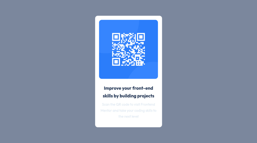
Design comparison
SolutionDesign
Community feedback
- @denieldenPosted almost 2 years ago
Hello Joshua, You have done a good work! 😁
Some little tips to improve your code:
- use
maintag to wrap the card and improve the Accessibility but not as a container of that one element - also you can use
articletag instead of a simpledivto the container card for improve the Accessibility - remove all unnecessary code, the less you write the better as well as being clearer: for example the
picturecontainer of image - use
min-height: 100vhto body instead ofheight, otherwise the content is cut off when the browser height is less than the content
Keep learning how to code with your amazing solutions to challenges.
Hope this help 😉 and Happy coding!
0 - use
Please log in to post a comment
Log in with GitHubJoin our Discord community
Join thousands of Frontend Mentor community members taking the challenges, sharing resources, helping each other, and chatting about all things front-end!
Join our Discord
