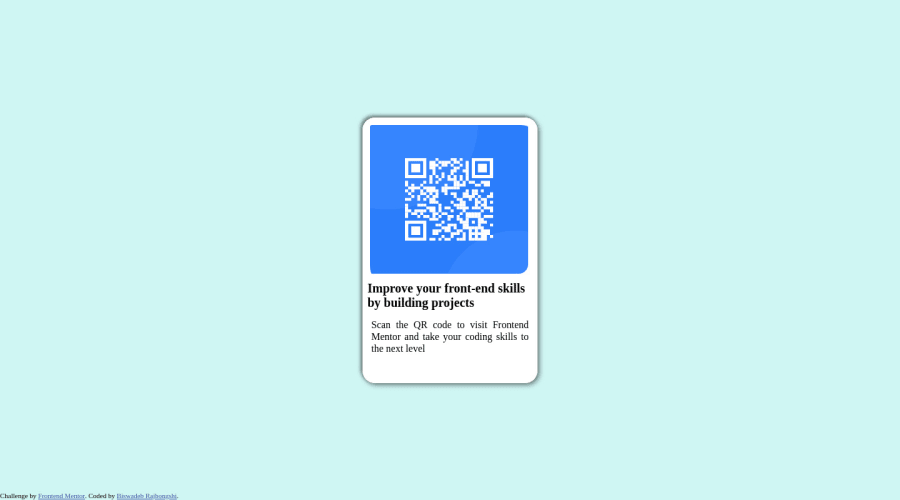
Design comparison
Solution retrospective
Hello, I have just completed this task. I have just HTML, and CSS. please tell me your opinion.
Community feedback
- @correlucasPosted over 2 years ago
Hello Biswadeb, congratulations for your first solution!
I saw the work you did with this qr code card solution and I've some tips that you can consider to improve a little bit the design:
1.The ackground color is uncorrect, to have a perfect match of colors, you can use a Google Chrome extension that allow you to eye-drop website colors, the extension is free and the name is Colorzilla.
The proper color is
Background-color: #D5E0ED;`2.The font-family isn't imported, you can find this font using Google Fonts and choosing the font-weights you want to use in your code, this website generates your a code to import in your **html ** or css file. Here's the html code for the font, but anyway you can find it in google:
<link rel="preconnect" href="https://fonts.googleapis.com"><link rel="preconnect" href="https://fonts.gstatic.com" crossorigin> <link href="https://fonts.googleapis.com/css2family=Outfit:wght@400;700&display=swap" rel="stylesheet">
3.Box-shadow your box shadow is a little bit strong, you can play around using a box-shadow generator tool and create better box-shadows. The
box-shadow
you've used in the card should be a little bit transparent, you can control the transparency working the box-shadow opacity.Here's the link for the box-shadow generator:
https://html-css-js.com/css/generator/box-shadow/
Feel free to ask me further question and I hope these advices could help you. Happy coding!
0 - @ldinskiPosted over 2 years ago
Nice one! I'd say that you should take a look at the report that frontendmentor provides on Accessibility and HTML issues - and correct these. Also, use the provided style guide that gives you the correct fonts and colours to use in the project, but if you prefer going off and styling it yourself, then that is fair enough!
Keep it up :)
0 - @debjitPosted over 2 years ago
You have too much card shadow. Do not add your github profile; only the link to the repository. The title would be better off with padding or a margin.
0
Please log in to post a comment
Log in with GitHubJoin our Discord community
Join thousands of Frontend Mentor community members taking the challenges, sharing resources, helping each other, and chatting about all things front-end!
Join our Discord