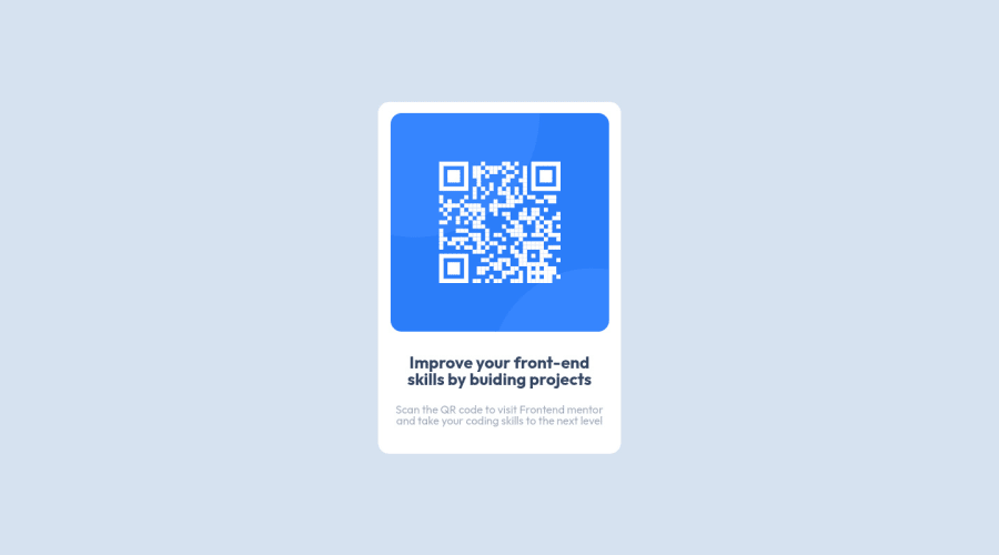
Design comparison
Solution retrospective
I have revisited this Challenge and i would really like to get feedbacks for it. Some of the points i can think of :- Some of the points which i think of are:- 1.why my screenshot is not similar to the design screenshot..even though on browser mobile and desktop it looks almost same to me ? 2.is my media query breakpoint correct? 3.Any suggestion related to good practice is also welcome.
Community feedback
- @AlexKMarshallPosted over 2 years ago
This looks good to me. The one thing I'd change is to add some padding to the
.cardThat way you can remove the
max-widthfrom the text and the image, and a few of the margins.In general, if you're looking to keep the children away from the sides of a parent, you want padding on the parent. It's the more common spacing property to use. Margin would come into play when adding gaps between siblings, like between the image and the heading, and the heading and the paragraph text. This can be achieved with a
margin-topandmargin-bottomon the headingMarked as helpful0 - @Bayoumi-devPosted over 2 years ago
Hey Ranjana,
My suggestions:
Document should have one main landmark, Contain the component with<main>.
<main> <div class="white-card"> //... </div> </main>-
Page should contain a level-one heading, Changeh2toh1You should always have oneh1per page of the document... in this challenge, you will useh1just to avoid theaccessibility issuethat appears in the challenge report... but don't useh1on small components<h1>should represent the main heading for the whole page, and for the best practice use only one<h1>per page. -
I suggest you center the component on the page with
Flexbox, by giving the parent element<main>the following properties:
body {
    background-color:var(--Light-gray);

    /* The scrollbar will appear because `<body>` has a default `margin` ---- Remove `margin`*/
    margin: 0;
}
main {    /* <---- Add */
   display: flex;
   justify-content: center;
   align-items: center;
   min-height: 100vh;
 }
.white-card{
    /* margin-left: auto;      <---Remove */
    /* margin-right: auto;      <---Remove */
    /* margin-top: 150px;      <---Remove */
    //...
}
Hope this is helpful to you... Keep coding👍
Marked as helpful0
Please log in to post a comment
Log in with GitHubJoin our Discord community
Join thousands of Frontend Mentor community members taking the challenges, sharing resources, helping each other, and chatting about all things front-end!
Join our Discord
