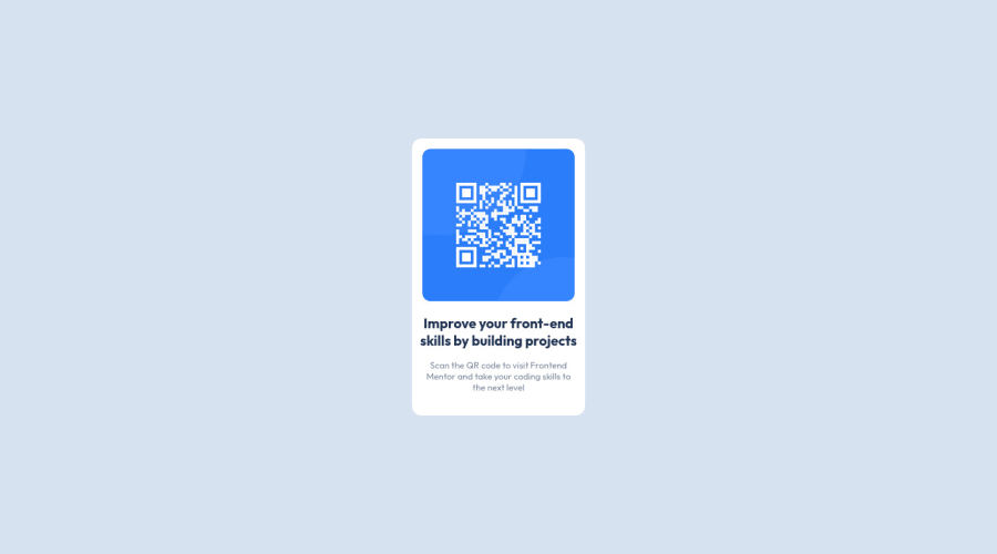
Design comparison
Community feedback
- @correlucasPosted over 2 years ago
👾Hi @jhon-UnCy, congratulations on your solution!👋 Welcome to the Frontend Mentor Coding Community!
Great solution and a great start! From what I saw you’re on the right track. I’ve few suggestions for you that you can consider adding to your code:
1.Clean your code by removing some unnecessary divs, most of the content can stand alone without a div. Use div only for blocks that need a special alignment or the content needs a special positioning.
2.Add the
alt textto improve accessibility.The alt attribute provides alternative information for an image if a user for some reason cannot view it (because of a slow connection, an error in the src attribute, or if the user uses a screen reader). ---><img src="./images/image-qr-code.png" alt="QR Code Frontend Mentor">3.Use a CSS reset to avoid all the problems you can have with the default CSS setup, removing all margins, and making the images easier to work, see the article below where you can copy and paste this CSS code cheatsheet: https://piccalil.li/blog/a-modern-css-reset/
4.Use relative units as
remoreminstead ofpxto improve your performance by resizing fonts between different screens and devices. These units are better to make your website more accessible. REM does not just apply to font size, but to all sizes as well.Here's my solution for this challenge if you wants to see how I build it: https://www.frontendmentor.io/solutions/qr-code-component-vanilla-cs-js-darklight-mode-nS2aOYYsJR
✌️ I hope this helps you and happy coding!
0 - @quantoshPosted over 2 years ago
Hi John, nice solution how about adding a bit of padding to the text?
Keep coding 🤖!
0
Please log in to post a comment
Log in with GitHubJoin our Discord community
Join thousands of Frontend Mentor community members taking the challenges, sharing resources, helping each other, and chatting about all things front-end!
Join our Discord
