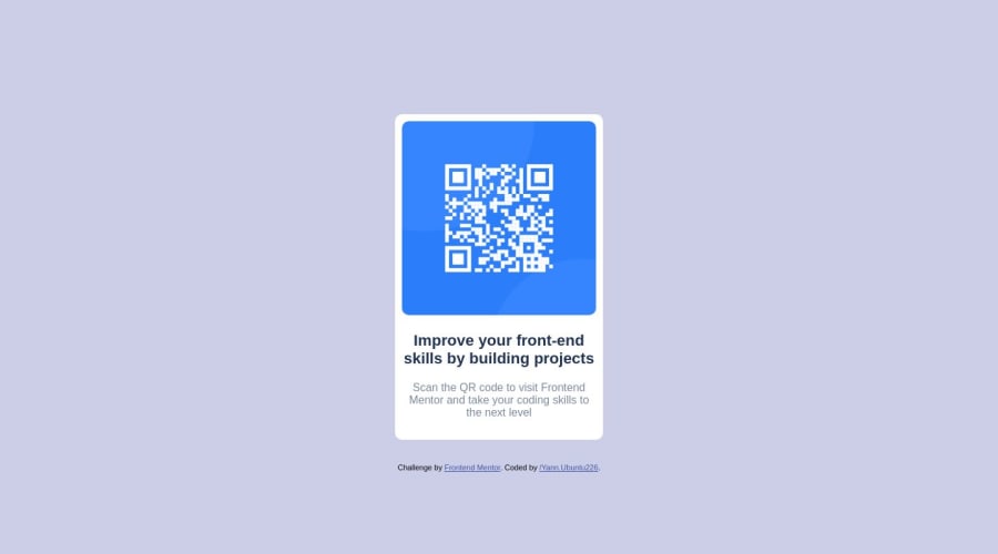
Design comparison
Community feedback
- @obocanegra-devPosted over 1 year ago
Hello Levi! 👋
Congratulations on completing your first challenge on Frontend Mentor! 🎉 I wanted to extend my warmest congratulations to you for your achievement.
Here are some suggestions to further enhance your project:
I highly recommend using semantic elements instead of relying heavily on
<div>s. Semantic elements like<header>,<nav>,<main>, and<footer>add meaning and structure to your HTML, improving accessibility and SEO.If there is only one heading, it's better to use
<h1>instead of<h2>. This ensures proper hierarchy and emphasizes the primary heading of your page.It would be beneficial to provide a more descriptive
altattribute for your image, such as "QR code to Frontend Mentor website". This helps users understand the purpose and content of the image, improving accessibility.Instead of setting a fixed width, it's better to use
max-width. This allows your content to be more responsive and adapt well to different screen sizes.I noticed that the imported font is not the one specified in the design. It should be "Outfit" instead of "Open Sans". Make sure to update the font import to match the design requirements.
I hope you find these suggestions helpful. You've done an amazing job so far, and I encourage you to keep up the great work!
If you have any questions or need further assistance, please feel free to ask. Good luck with your future projects! 🚀✨
Best regards, Oscar
1@LEVI226Posted over 1 year ago@obocanegra-dev thanks for your adding,I l'll change it to be more SEO friendly
1
Please log in to post a comment
Log in with GitHubJoin our Discord community
Join thousands of Frontend Mentor community members taking the challenges, sharing resources, helping each other, and chatting about all things front-end!
Join our Discord
