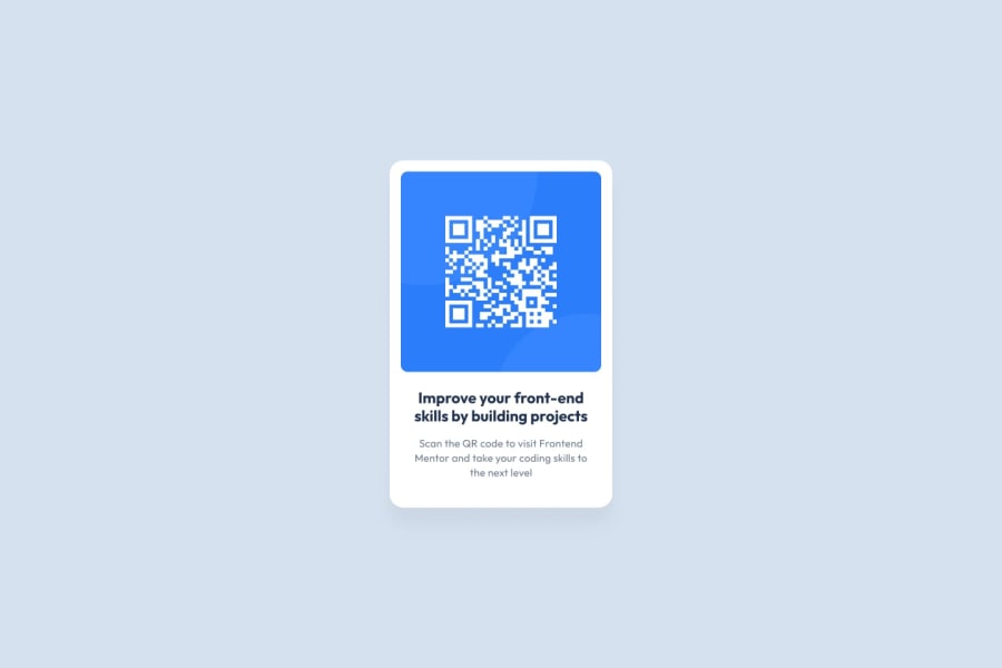
Design comparison
Community feedback
- @Psargar616Posted about 1 year ago
Hey @Ashfinn! Great Job on the Product Preview Card Component Challenge! 🌟
I just wanted to drop a quick message to say that your solution for the "Product Preview Card Component" challenge looks fantastic! You've done a great job with the design and coding.
A friendly tip: consider adding a uniform padding of around 10px to the image div, text div, and the container to get even closer to the original design. It'll enhance the visual consistency of your project and increase the font size of heading just a bit. Check if the following css helps.
#container
			{
				padding: 10px;
			}
			#qr{
				padding : 10px;
                                 object-fit : cover;
			}
			#qr img{
				width: 100%;
				height: 100%;
				border-radius: 10px;
			}
			#text {
				padding : 10px
			}
			#text h1{
				font-size: 1.5rem;
			}
A quick suggestion: consider separating your styles into a style.css file. It will make your project more organized and easier to maintain as it grows.
Also, adding comments to explain your code decisions can be super helpful, both for you and anyone else who might review your work. It's a great practice to make your code more understandable and user-friendly.
Remember, these are just little tweaks - your work is already fantastic! Keep up the amazing effort, and if you have any questions or need further feedback, don't hesitate to ask.
Keep up the amazing work, and I'm looking forward to seeing what you create next! if you found this feedback useful, please mark this comment as helpful
Marked as helpful0@AshfinnPosted about 1 year ago@Psargar616 Thank you for your advice. I will keep these in mind and I will try to make my next project better.
1
Please log in to post a comment
Log in with GitHubJoin our Discord community
Join thousands of Frontend Mentor community members taking the challenges, sharing resources, helping each other, and chatting about all things front-end!
Join our Discord
