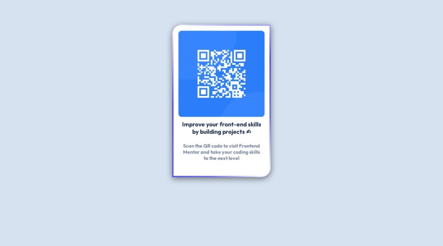
Design comparison
SolutionDesign
Solution retrospective
Any tips on how to make this better would be appreciated, Especially in how it is displayed on mobile devices.
Made a few corrections like changing my <h3> to <h1> as adviced.
Thank you in advance for the tips.
Community feedback
- @0xabdulkhaliqPosted over 1 year ago
Hello there 👋. Congratulations on successfully completing the challenge! 🎉
- I have other recommendations regarding your code that I believe will be of great interest to you.
QR iMAGE ALT TEXT 📸:
- Since this component involves scanning the QR code, the image is not a decoration, so it must have an
altattribute.
- The
altattribute should explain the purpose of theimage.
- E.g.
alt="QR code to frontendmentor.io"
<img src="/images/image-qr-code.png" alt="QR code to frontendmentor.io">
.
I hope you find this helpful 😄 Above all, the solution you submitted looks awesome with curved borders !
Happy coding!
Marked as helpful0
Please log in to post a comment
Log in with GitHubJoin our Discord community
Join thousands of Frontend Mentor community members taking the challenges, sharing resources, helping each other, and chatting about all things front-end!
Join our Discord
