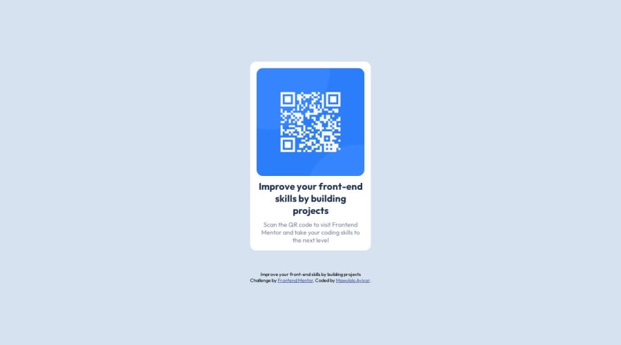
Design comparison
Community feedback
- @Islandstone89Posted 10 months ago
HTML:
-
Every webpage needs a
<main>that wraps all of the content, except for<header>andfooter>. This is vital for accessibility, as it helps screen readers identify the "main" section of a page. Change the first<div>into a<main>. NB: It's common practice to use classes instead of IDs. You can give it two classes like this:<main class="container round-edge">. -
.attributionshould be a<footer>, and its text must be wrapped in a<p>. Remove the<br>.
CSS:
-
It's good practice to include a CSS Reset at the top.
-
On the
body, remove thewidth- it is 100% wide by default. Changeheighttomin-height- this way, the content will not get cut off if it grows beneath the viewport. Addjustify-content: centerandalign-items: centerto center the card horizontally and vertically. -
max-widthon the card must be in rem - around20remworks fine. -
Now that the card is centered using Flexbox, remove
margin: auto. -
font-sizemust never be in px. This is bad for accessibility, as it prevents the font size from scaling with the user's default setting in the browser. Use rem instead. -
Remove the
widthon the image. -
Add
display: blockandmax-width: 100%on the image - the max-width prevents it from overflowing its container.
Marked as helpful1@LolontorPosted 10 months ago@Islandstone89 Thank you for the feedback. I appreciate it. Also, how do I position the footer at the end of my page.
1@Islandstone89Posted 10 months ago@Lolontor I would add
gap: 2remon thebody, this creates some space between the card and the footer.1 -
- @MelvinAguilarPosted 10 months ago
Hello there 👋. Good job on completing the challenge !
I have some suggestions about your code that might interest you.
HTML 🏷️:
- Use semantic elements such as
<main>and<footer>to improve accessibility and organization of your page.
CSS 🎨:
- The
width: 100%property in thebodytag is not necessary. Thebodytag is a block element and it will take the full width of the page by default.
- Use
min-height: 100vhinstead ofheight. Setting the height to 100vh may result in the component being cut off on smaller screens, such as a mobile phone in landscape orientation.
I hope you find it useful! 😄 Above all, the solution you submitted is great!
Happy coding!
Marked as helpful1@LolontorPosted 10 months ago@MelvinAguilar Thank you for your review and suggestion. I really appreciate your feedback.
0 - Use semantic elements such as
Please log in to post a comment
Log in with GitHubJoin our Discord community
Join thousands of Frontend Mentor community members taking the challenges, sharing resources, helping each other, and chatting about all things front-end!
Join our Discord
