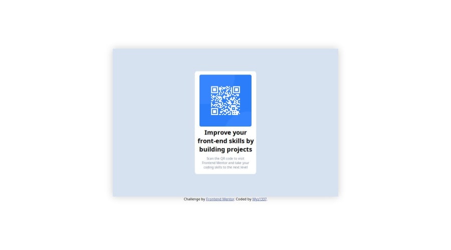


Design comparison
SolutionDesign

Solution retrospective
What are you most proud of, and what would you do differently next time?
I'm proud of finishing this project as it is my first step into front-end development. Next time, I will check upon more advices of other developer more.
What challenges did you encounter, and how did you overcome them?I had trouble with the responsive design when we use a mobile phone size screen. I look up for some code example to know how to do it (I've never used specific css condition for responsive design)
What specific areas of your project would you like help with?I want to learn more about better HTML semantics and more CSS about responsivity
Community feedback
Please log in to post a comment
Log in with GitHub
Join our Discord community
Join thousands of Frontend Mentor community members taking the challenges, sharing resources, helping each other, and chatting about all things front-end!
Join our Discord