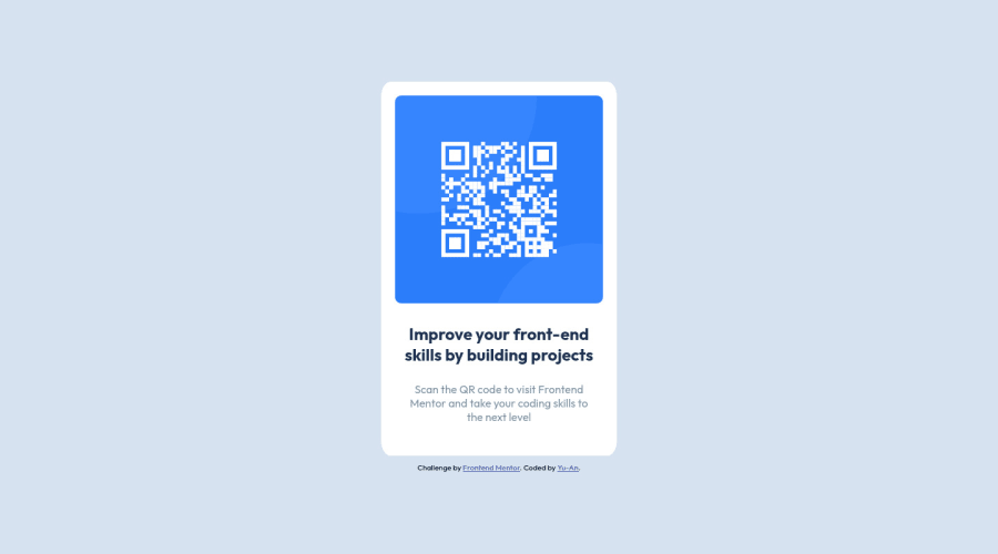
Design comparison
Solution retrospective
While I was working on this challenge, I came across two issues that I couldn't solve:
- When making the edges of the "container" (the one that housed the QR code and the text) rounded by using border-radius, I was unable to make it smooth; for some reason there are somewhat jagged edges
- When zooming in on the browser, the top would become cut-off, and I would be unable to scroll to the top to view the content there
Please let me know if you know what is causing the problems, thanks!
Community feedback
- @mycrochipPosted over 2 years ago
Hello Yu-An,
I congratulate you on beginning your journey on Frontend mentor. You'll find so much value in this community.
You've put forward a good solution to the project challenge.
At first glance, I see you've added styles to your
<html>
element in your stylesheet. As a personal best practice, and I believe, with most developers as well, I do not add styles to my HTML. I prefer to put such styles in the<body>
element and if I need an extra container, I'll just nest another<div>
element within the 'body' to surround all the current child elements.The first issue was caused by setting
html { display: flex; }
The flex container gives its children fluid dimensions when they are not set. So, the body has a width of less than 100% of the available screen.
FIX: Replace the html selector with the body selector as follows:
body { display: flex; flex-direction: column; justify-cotent: center; align-items: center; height: 100vh; width: 100%; }
This should fix some layout issues. You'd still need to adjust your card for mobile view.
With regards to the rounded edges being cut off, the culprit here is still the flex layout. The card container (main) is so fixed to the top of its parent which is the body.
FIX: Make the card center on the page which will make it move away from the top. This is not centered currently even if you have a
justify-content
andalign-items
set tocenter
because these attribute don't know the dimension of your element (i.e how tall or wide it is). So, you can either set a fixedwidth
andheight
for the 'main' container (which i don't recommend due to overflow issues of child contents) or give a block margin to the container (or block padding to its parent), e.g:main { margin-top: 20%; margin-bottom: 20%; } /*OR*/ main { margin-block: 20% 20%; }
Marked as helpful1@yuany2036Posted over 2 years ago@mycrochip Thanks! I really appreciate the existence of such a great community with a chance to practice my HTML and CSS skills, and also for your feedback! And yes you are correct, there is styling in my HTML, but that's just the default styling that came with the download for the "credits", I try my best not to have any styling in my HTML.
As for my first issue, after asking my teacher (I'm doing a Web Dev course), I was told to simply switch the border-radius from a percentage to a px value, which seems to have solved it! My question would be: would it still be necessary to implement your code? Is it maybe still a best practice to set the width to 100% when using flex?
As for the second issue, I'll have to look a bit more into it and get back to you on whether or not I was able to figure it out as our course haven't covered some of the things you've mentioned.
But thank you so much for the feedback! Really appreciate that and the warm welcome!
1@mycrochipPosted over 2 years ago@yuany2036 Hi Yu-An, Great to know you have a mentor by your side.
As for whether to implement the 100% value. My take is that styling in CSS is much like solving a problem in Maths, there are many ways to arrive at the same solution. I advise that no matter which implementation you use to achieve the desired result, knowing the rudiments i.e. the pros and cons of the methods used as well as how they help in achieving the desired result is what is more important. This will help in avoiding any surprises such as conflicts with other attributes or elements during styling.
The body should still always be 100% width (not 100vw or lesser). You can then use another container like
main
for the card itself. This would make thebody
focus on thebackground color
andflex
layout styles.Happy Coding!
1
Please log in to post a comment
Log in with GitHubJoin our Discord community
Join thousands of Frontend Mentor community members taking the challenges, sharing resources, helping each other, and chatting about all things front-end!
Join our Discord