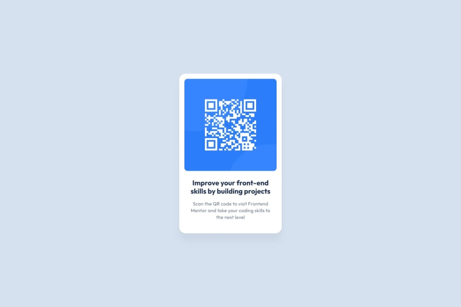
Design comparison
SolutionDesign
Community feedback
- @tobaojoPosted 23 days ago
Hi, The HTML looks good! Though I would add a <main> tag around the <div> of the outer card to address / improve accessibility concerns. Your CSS is also a great start though I think the h1 should be center aligned along with taking a closer look at the colours being used from the design file. The other use of the colours is great and I think this is a good effort in terms of code structure.
Marked as helpful1
Please log in to post a comment
Log in with GitHubJoin our Discord community
Join thousands of Frontend Mentor community members taking the challenges, sharing resources, helping each other, and chatting about all things front-end!
Join our Discord
