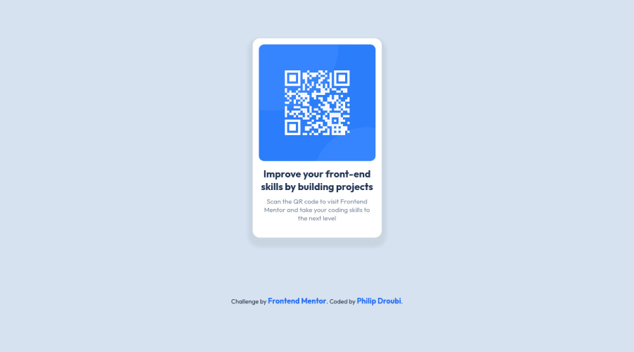
Design comparison
Solution retrospective
Hey everyone 🙋♂️, this is my solution for QR-code-component challenge, please take a look and give me your feedback. Thanks :)
Please log in to post a comment
Log in with GitHubCommunity feedback
- @correlucas
👾Hello Philip-dro, congratulations for your new solution!
Hey Philip your solution is just great, the design is amazing and the animation on hover too, is really amazing to see one creative solution like yours.
About your solution there's not much to improve here, but if you want to change something you can clean the
html structureremoving some unnecessary divs, for example, all you need is a single<main>or<div>to keep all the content inside, and nothing more. The ideal structure is thedivand only the image, heading and paragraph.See the structure below:
<body>
<main>
<img>
<h1></h1>
<p></p>
</main>
</body>
Your shadow is too much dark and strong, to create a smooth shadow you need to give it less
opacityand moreblurhere’s a good value for this shadowbox-shadow: 5px 5px 15px 5px rgb(0 0 0 / 5%);Here's my solution for this challenge if you wants to see how I build it: https://www.frontendmentor.io/challenges/qr-code-component-iux_sIO_H/hub/qr-code-component-vanilla-cs-js-darklight-mode-nS2aOYYsJR
👋 I hope this helps you and happy coding!
- @PhoenixDev22
Hello Philip-dro,
Congratulation on completing this challenge. your solution looks great. I have some suggestions regarding your solution if you don’t mind:
- You can use
<main>landmark to wrap the card. HTML5 landmark elements are used to improve navigation.
- Page should contain
<h1>. In this challenge , as it’s supposed to be a part of a whole page, you may use<h1>withsr-onlyclass hidden visually and present for assistive tech users.
- The opening tag and the closing tag are not the same.
**<h2>**Improve your front-end skills by building projects**</h3>**,
- In my opinion, the alternate text should indicate where the Qr code navigate the user : like
QR code to frontend mentor. Also the alternate text should not be hyphenated, it should be human readable.
CSS:
- Consider using
remfor font size .If your web content font sizes are set in absolute units, such as pixels, the user will not be able to re-size the text or control the font size based on their needs. Relative units “stretch” according to the screen size and/or user’s preferred font size, and work on a large range of devices.
- Remember a css reset on every project. That will do things like set the images to display block and make all browsers display elements the same.
- It's recommended to include a git ignore. This came with your starter files. It's less important in this challenge but will become extremely important as you move onto larger projects with build steps.
Aside these , Good work! Hopefully this feedback helps
- You can use
Join our Discord community
Join thousands of Frontend Mentor community members taking the challenges, sharing resources, helping each other, and chatting about all things front-end!
Join our Discord
