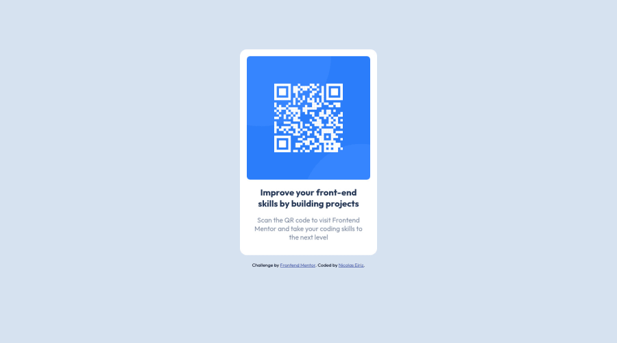
Design comparison
Solution retrospective
Hi guys, I just finished my second challenge. For this one I couldn't center the div vertically using the flebox properties, I don''t know why, so finally I decided to use margin to center it.
Really apreciate your feedback on this.
Nicolas
Please log in to post a comment
Log in with GitHubCommunity feedback
- @francisldn
Hi @NicolasEiriz, regarding your question, this is caused by the default body height setting. Body height is by default set to the height of the elements (
.card+.attribution) on the page. So you should add below to expand the body height to 100% of the viewport height. Then flexbox will automatically center the elements.body { min-height: 100vh; }Refer to this article to learn more.
Marked as helpful - @Sarah-C-Arvin
This looks really good! For the centering issue, try adding min-height: 100vh; in your body styles instead of using margin on your card div, and that should help:)
Marked as helpful
Join our Discord community
Join thousands of Frontend Mentor community members taking the challenges, sharing resources, helping each other, and chatting about all things front-end!
Join our Discord
