Not Found
Not Found
Not Found
Not Found
Not Found
Not Found
Not Found
Not Found
Not Found
Not Found
Not Found
Not Found
Not Found
Not Found
Not Found
Not Found
Not Found
Not Found
Not Found
Not Found

Submitted

QR-Code-Component

@sila254

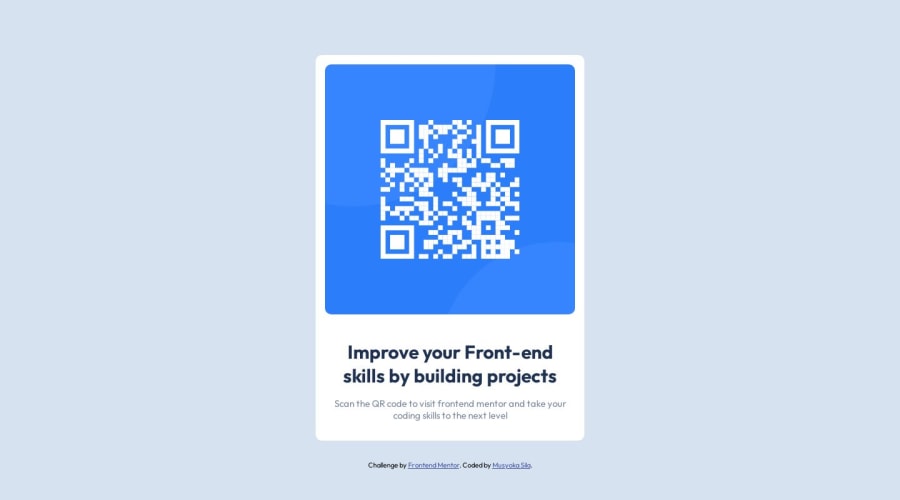
Desktop design screenshot for the QR code component coding challenge

This is a solution for...

  • HTML
  • CSS
1newbie
View challenge

Design comparison


SolutionDesign

Solution retrospective


Unsure if there is a box shadow. Difficulty in entering the image once in the div element.

Community feedback

@0xabdulkhaliq

Posted

Hello there 👋. Congratulations on successfully completing the challenge! 🎉

  • I have other recommendations regarding your code that I believe will be of great interest to you.

HTML 🏷️:

  • This solution may cause accessibility errors due to lack of semantic markup, which causes lacking of landmark for a webpage and allows accessibility issues to screen readers, due to accessibility errors our website may not reach its intended audience, face legal consequences, and have poor search engine rankings, highlighting the importance of ensuring accessibility and avoiding errors.
  • What is meant by landmark ?, They used to define major sections of your page instead of relying on generic elements like <div> or <span>. They are use to provide a more precise detail of the structure of our webpage to the browser or screen readers
  • For example:
    • The <main> element should include all content directly related to the page's main idea, so there should only be one per page
    • The <footer> typically contains information about the author of the section, copyright data or links to related documents.
  • So resolve the issue by replacing the <div class="container"> element with the proper semantic element <main> along with <div class="attribution"> into a <footer> element in your index.html file to improve accessibility and organization of your page

.

I hope you find this helpful 😄 Above all, the solution you submitted is great !

Happy coding!

Marked as helpful

0
Ambadi M P 380

@Soaphub

Posted

Hello sila98, well done all looks good.

  • I could see a box shadow in the design. If u want any u can add them to the class .container, using property box-shadow: h-offset(px) v-offset(px) blur(px) spread(px) colour;. Look at w3schools for more details on box shadow.

  • The method you used to select the image element is correct. There are many ways and the order in which the style is prioritized as higher to lower is given below. The higher order overrides the lower one.

  1. You could add an id or class to the image tag.
  2. Use a hierarchical selector, the one you used. eg * .container img*
  3. Finally the hierarchical selector using elements i.e div > img.
  • Final suggestion, you could use media queries for responsive websites. So you can reduce size in different breakpoints and avoid content overflowing out of the screen. You have been using the same size for all screens. eg: @media (max-width: 991.98px){ add the styles here}

Marked as helpful

0
Ecem Gokdogan 9,380

@ecemgo

Posted

Some recommendations regarding your code that could be of interest to you.

  • If you use flexbox in the body, you don't need to use margin
  • You can remove border-radius and font-size if you want
body {
  /* margin: 20px; */
  /* border-radius: 10px; */
  /* font-size: 15px; */
}
  • When you use flexbox in the body, you don't need to use margin in the .container to center the card
  • If you use max-width, the card will be responsive
  • You can update border-radius if you want
.container {
  /* border-radius: 10px; */
  border-radius: 5%;
  /* margin-bottom: 32px; */
  max-width: 300px;
}
  • In addition to that above, in order to make the card responsive and the image positioned completely on the card, you'd better add width: 100% to the img
  • You can also add border-radius to img
.container img {
  /* border-radius: 10px; */
  /* margin-bottom: 16px; */
  width: 100%;
  border-radius: 5%;
}
  • You can add font-size and margin in this way
.container h1 {
  font-size: 20px;
  margin: 20px 10px;
}
.container p {
  /* margin-bottom: 16px; */
  margin: 10px 10px 20px;
  font-size: 16px;
}
  • Finally, if you follow the steps above, the solution will be responsive. Additionally, you can remove media queries.
/* 
@media (min-width: 500px) {
    .container{
        width: 400px;
 }
} */

Hope I am helpful. :)

0

Please log in to post a comment

Log in with GitHub
Discord logo

Join our Discord community

Join thousands of Frontend Mentor community members taking the challenges, sharing resources, helping each other, and chatting about all things front-end!

Join our Discord