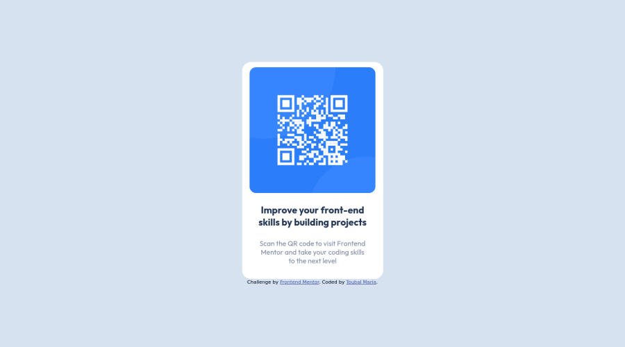
Design comparison
Solution retrospective
Challenge completed in less than 2h. Any feedback for a better or more optimized approach is highly appreciated!
Community feedback
- @Bayoumi-devPosted almost 3 years ago
Hey Maria,
My suggestions:
Document should have one main landmark, Contain the component with<main>.
<main> <div class="card"> //... </div> </main>-
Page should contain a level-one heading, Changehtoh1(There is no element calledh) You should always have oneh1per page of the document... in this challenge, you will useh1just to avoid theaccessibility issuethat appears in the challenge report... but don't useh1on small components<h1>should represent the main heading for the whole page, and for the best practice use only one<h1>per page. There are six levels of section headings<h1>to<h6> -
All page content should be contained by landmarks, Contain the attribution with<footer>.
<footer>
   <div class="attribution">
      //...
   </div>
</footer>
Hope this help!... Keep it up👍
1 - @maaghiaPosted almost 3 years ago
Your comment helped me understand the way accessibility issues should be handled I will take this into consideration thank you.
0
Please log in to post a comment
Log in with GitHubJoin our Discord community
Join thousands of Frontend Mentor community members taking the challenges, sharing resources, helping each other, and chatting about all things front-end!
Join our Discord
