Design comparison
Community feedback
- @MelvinAguilarPosted almost 2 years ago
Hello there 👋. Good job on completing the challenge !
I have other suggestions about your code that might interest you.
HTML 🏷️:
- Use semantic elements such as
<main>and<footer>to improve accessibility and organization of your page.
- You should not use inline-CSS because it is not a good practice. Instead, you should use an external stylesheet to style your page. By doing this, you will be able to have a better organization of your code and will be able to understand it better.
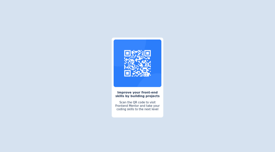
- Since this component involves scanning the QR code, the image is not a decoration, so it must have an
altattribute. Thealtattribute should explain its purpose. e.g.QR code to frontendmentor.io
CSS 🎨:
- Use
min-height: 100vhinstead ofheight. Setting the height to 100vh may result in the component being cut off on smaller screens, such as a mobile phone in landscape orientation.
CSS Reset 🔄:
-
You should use a CSS reset. A CSS reset is a set of CSS rules that are applied to a webpage in order to remove the default styling of different browsers.
CSS resets that are widely used:
I hope you find it useful! 😄 Above all, the solution you submitted is great!
Happy coding!
0 - Use semantic elements such as
- @HassiaiPosted almost 2 years ago
Replace<div class="body">with the main tag and <div class="attribution"> with the footer tag to fix the accessibility issues. click here for more on web-accessibility and semantic html
Give the alt attribute a value, its value is the description of the image
To center .main on the page using flexbox, replace the height in the body with min-height: 100vh.
There is no need to give .main a height value. For a responsive content , replace the width in .main with a max-width and increase the its value and the padding value for it to be equivalent to the width and padding of the design.
max-width:320px: padding: 15px.Give width a margin value for all the sides, text-align: center and a font-size of 15px which is 0.9375rem, this will be the font-size of both p and h1. There is no need to give p and h1 font-weight value give p opacity: 0.5 for the faded color.
Use relative units like rem or em as unit for the padding, margin, width values and preferably rem for the font-size values, instead of using px which is an absolute unit. For more on CSS units Click here
Hope am helpful.
Well done for completing this challenge. HAPPY CODING
0
Please log in to post a comment
Log in with GitHubJoin our Discord community
Join thousands of Frontend Mentor community members taking the challenges, sharing resources, helping each other, and chatting about all things front-end!
Join our Discord
